
The Landscape Company provides high quality landscape design, build and install in the San Diego County area.
Client requested a re-brand and positioning strategy, to remind existing customers that they are an established, growing and competitive business, stand out from the crowd, and to attract new clients as well as new partners to their contracting business model.
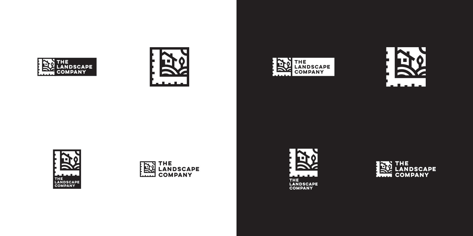
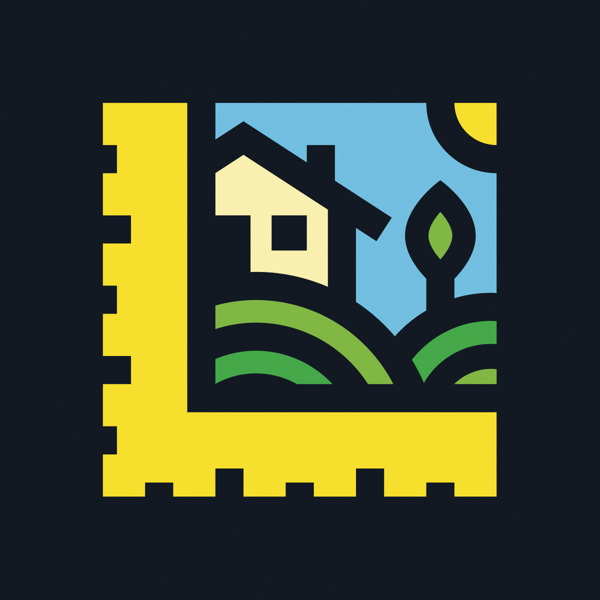
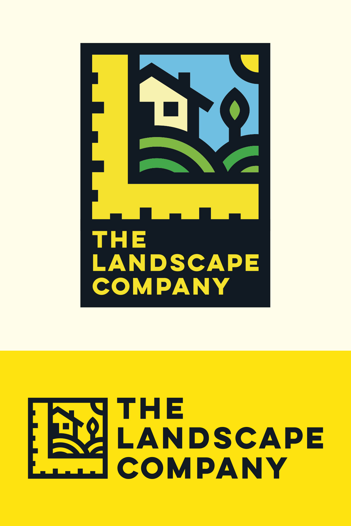
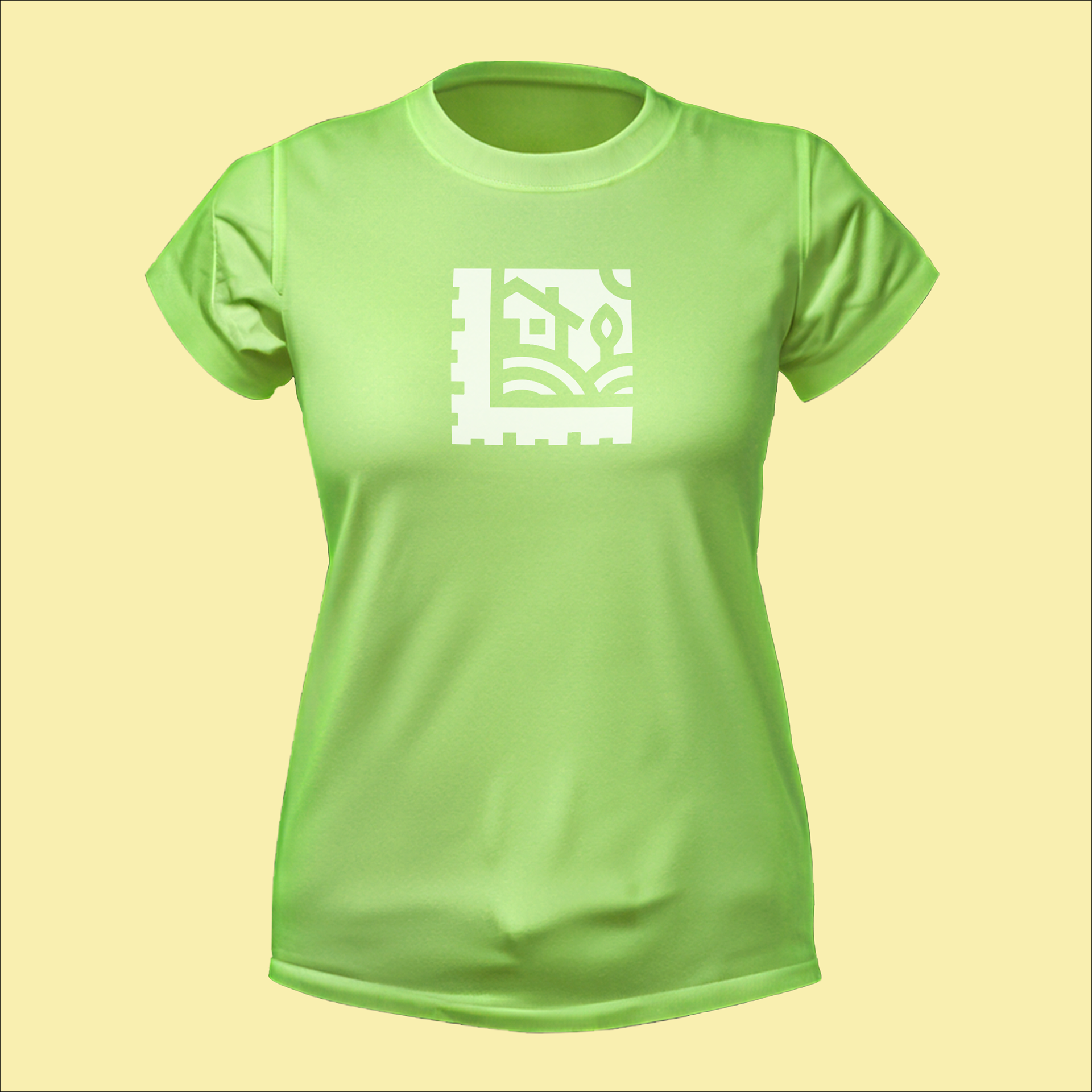
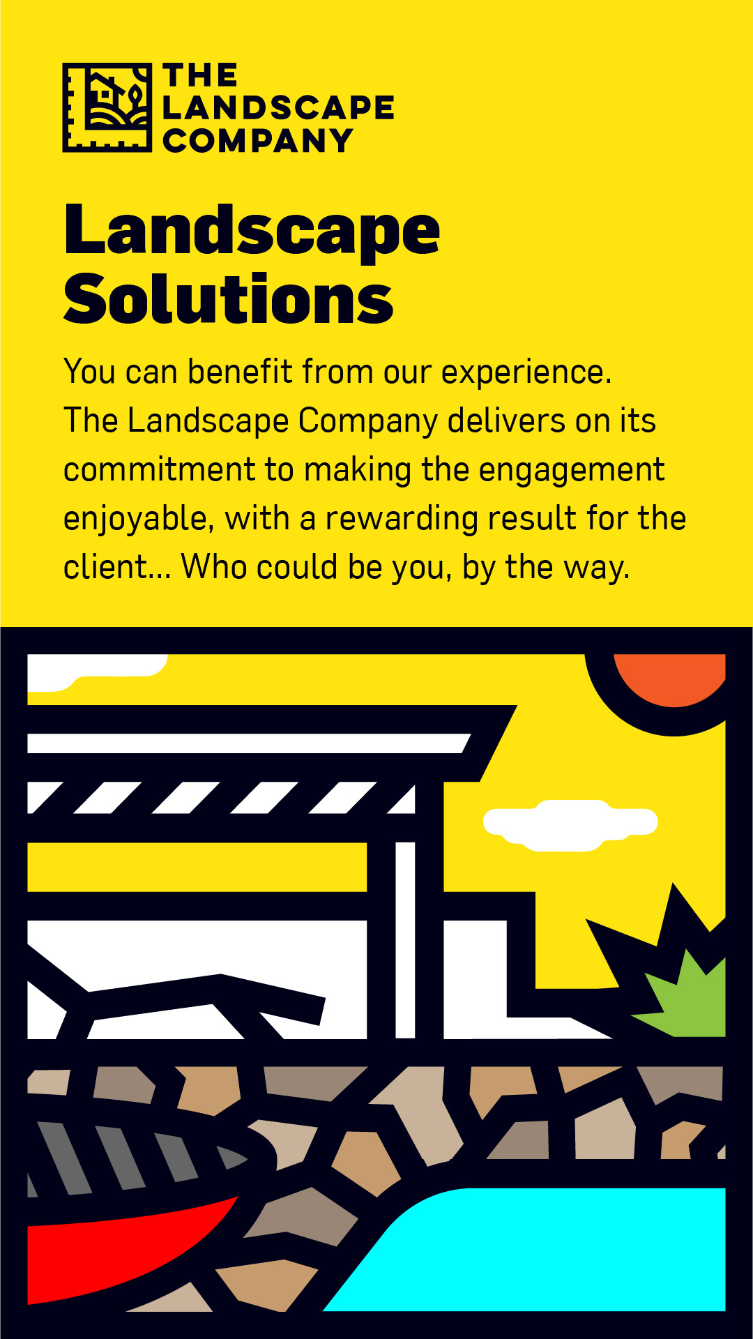
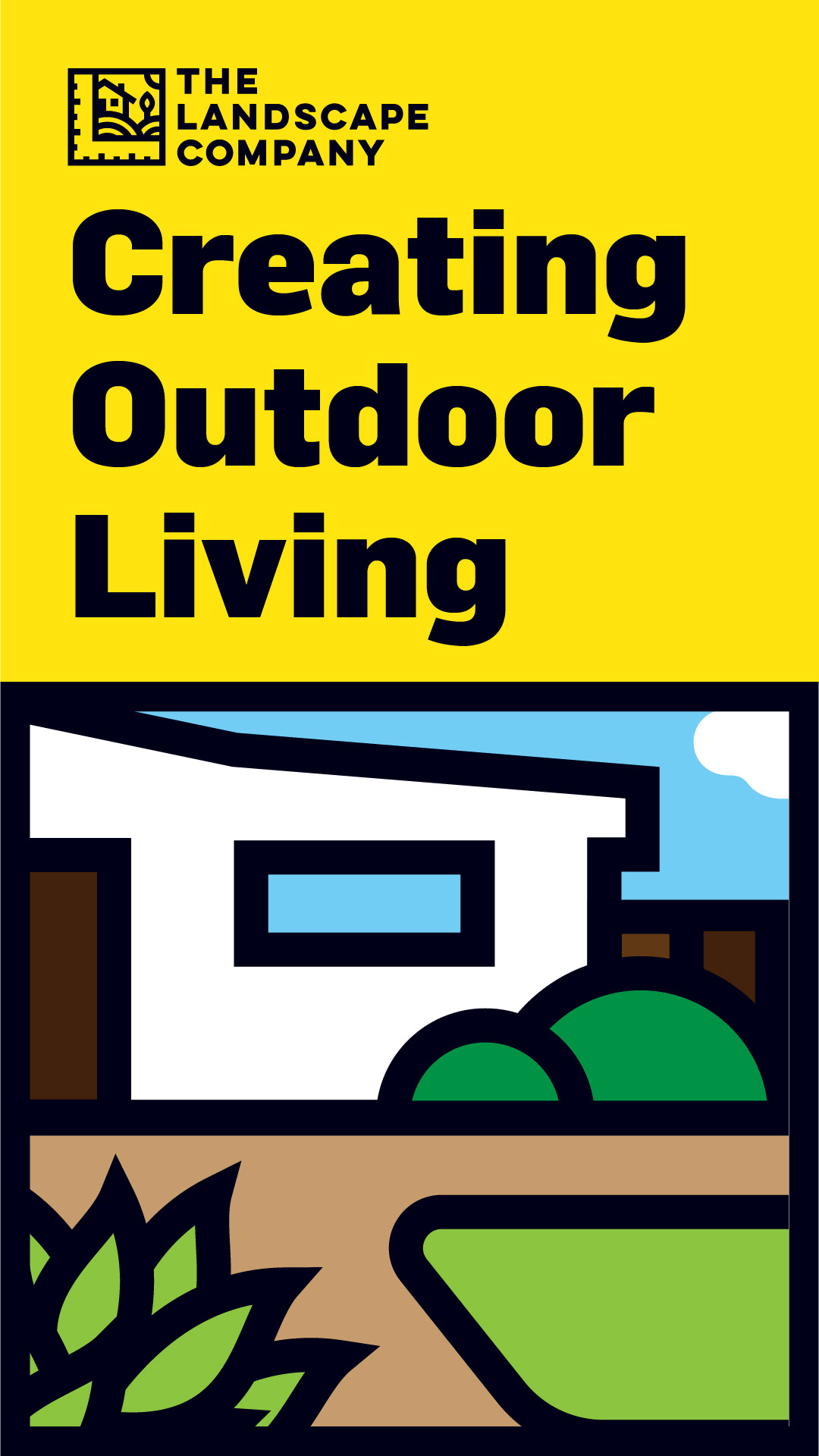
L is for Landscape, and for logo too, thats good enough to get started. This, along with a few other key ingredients (aka details from the brief), set a clear path to a creative solution that combines simplicity and boldness yet is kind and approachable.
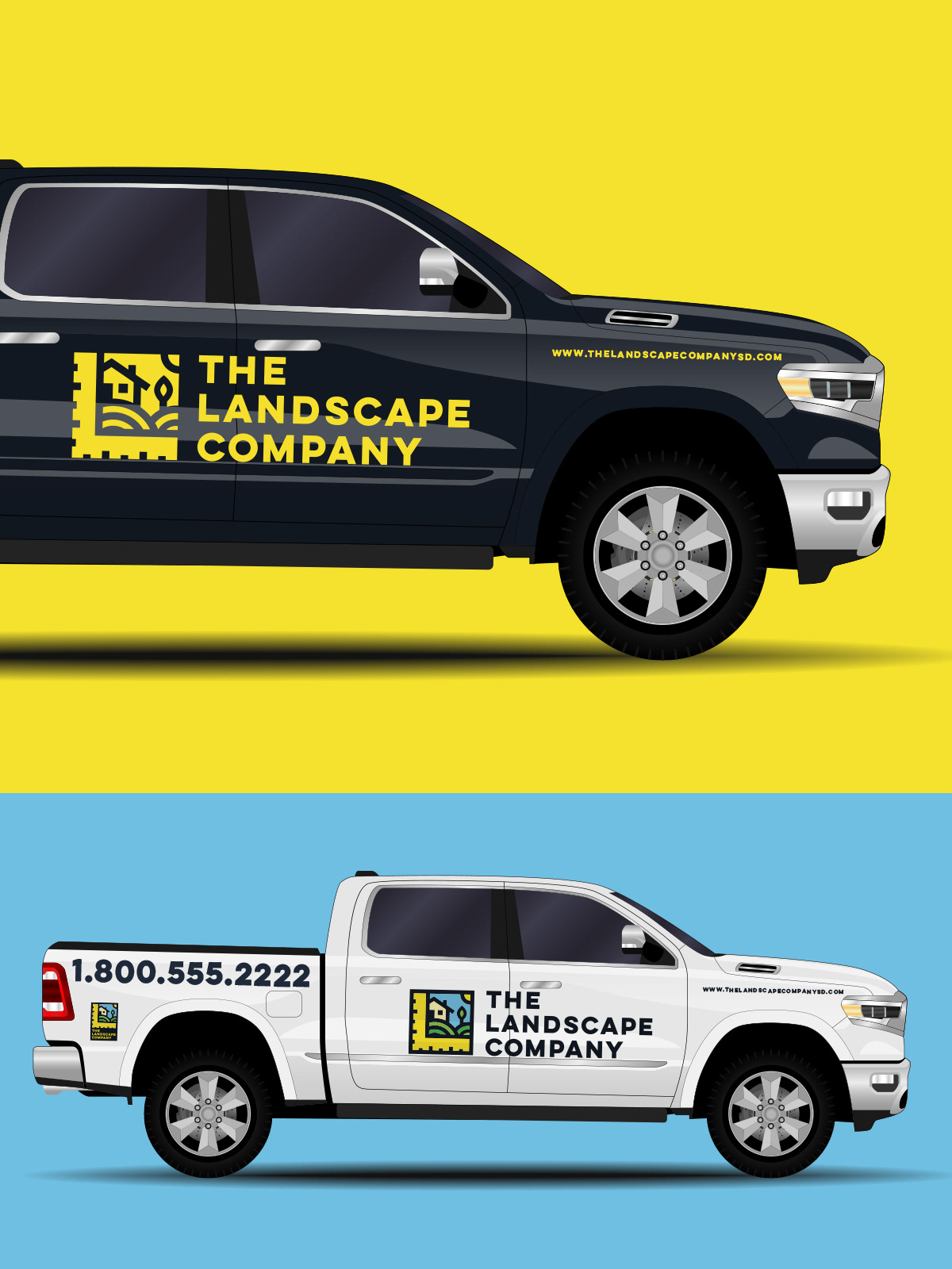
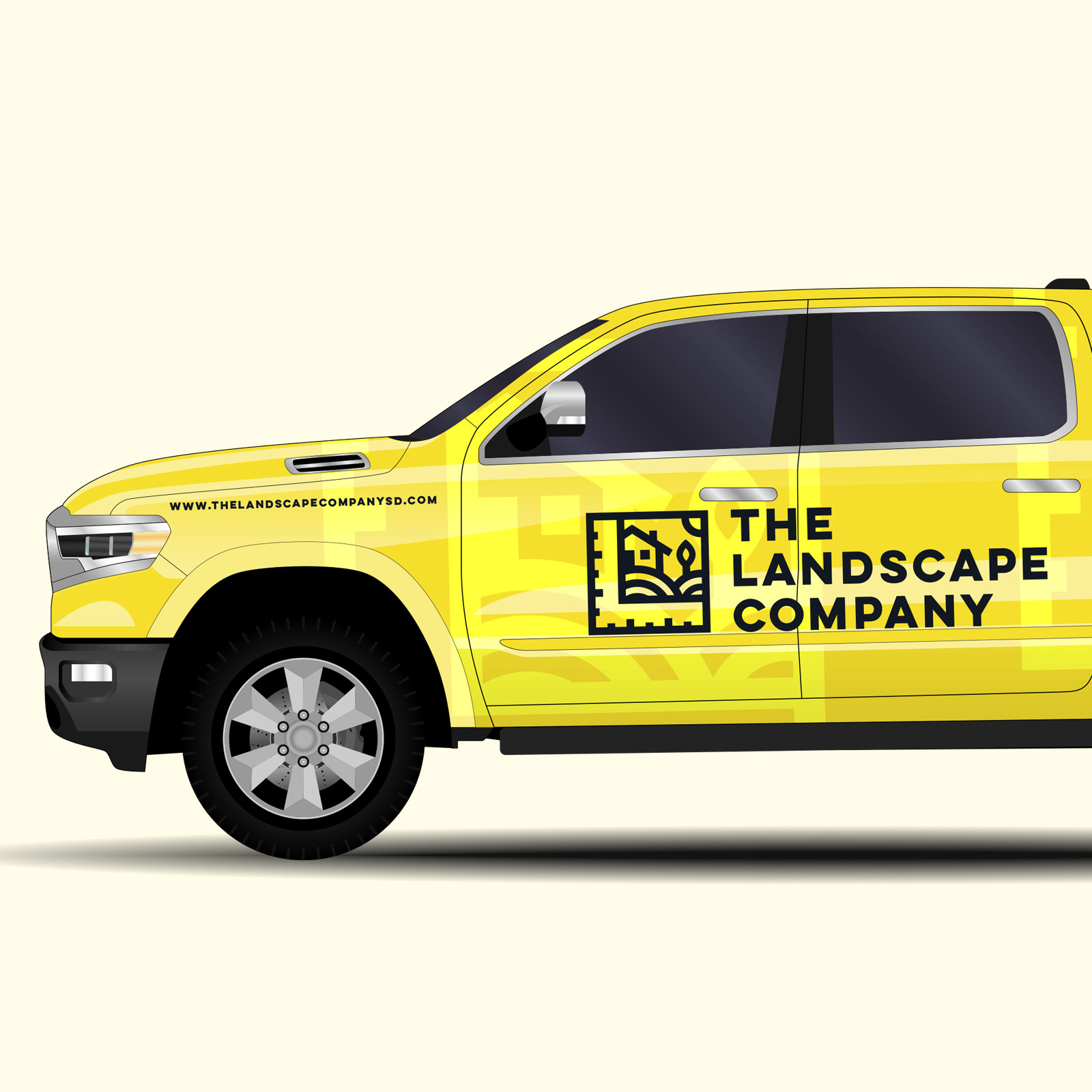
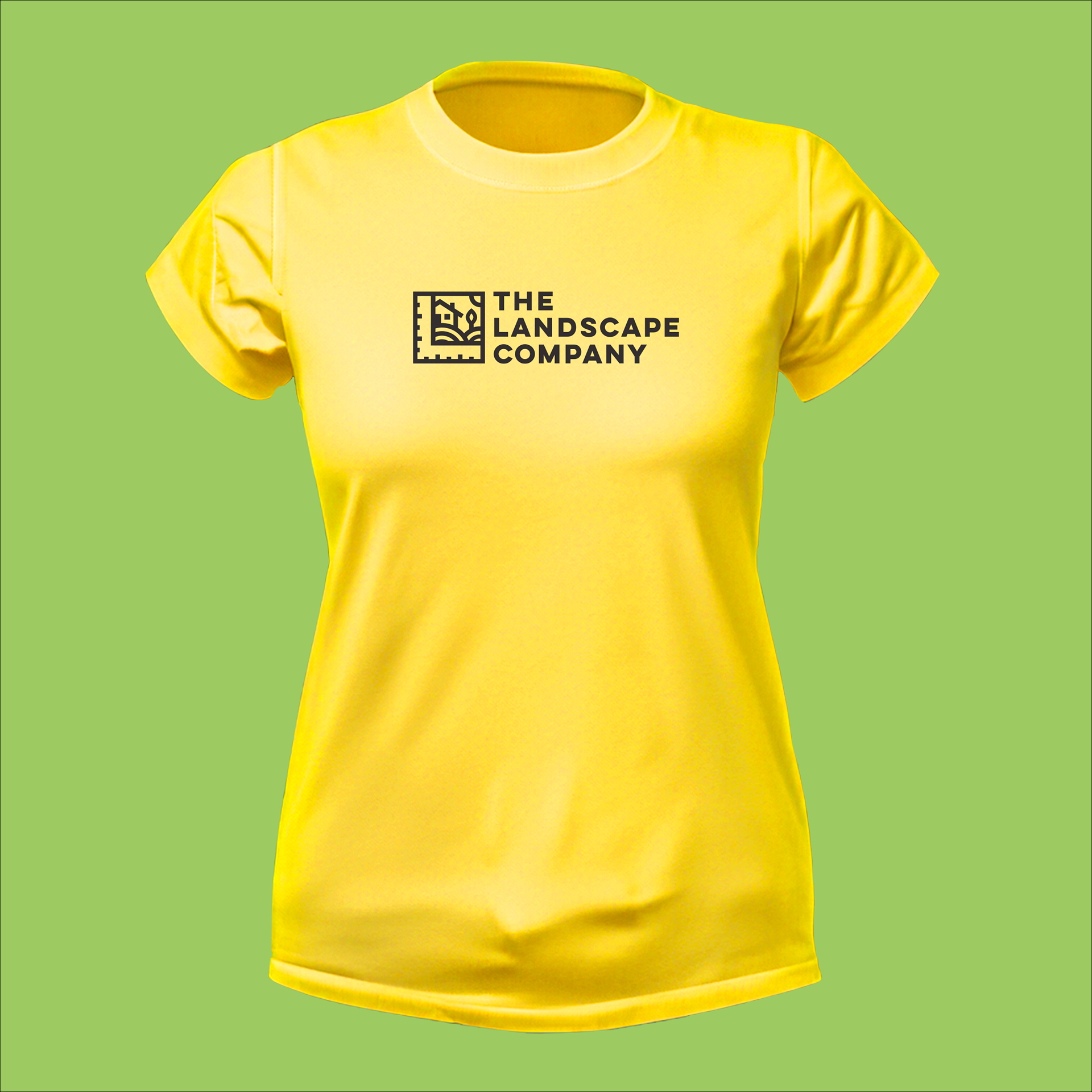
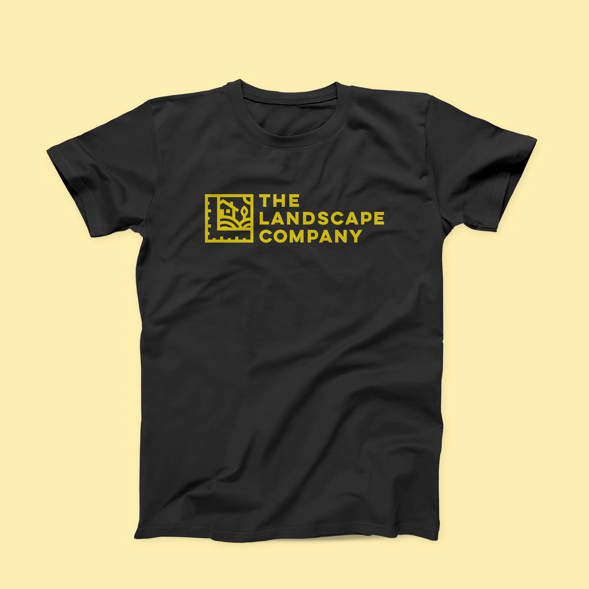
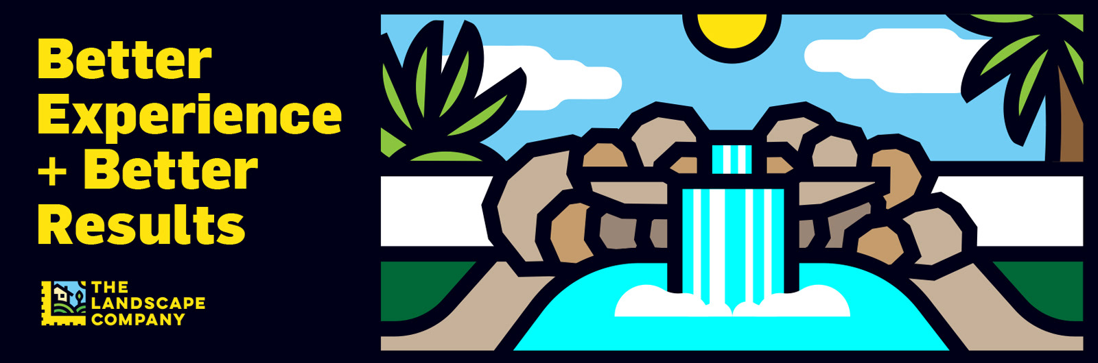
Bright and eye catching colors, complimented by contrasting and darker tones where chosen as reference of palettes that are commonly understood as relevant to the industry.
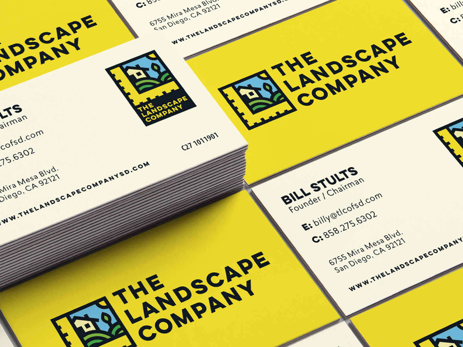
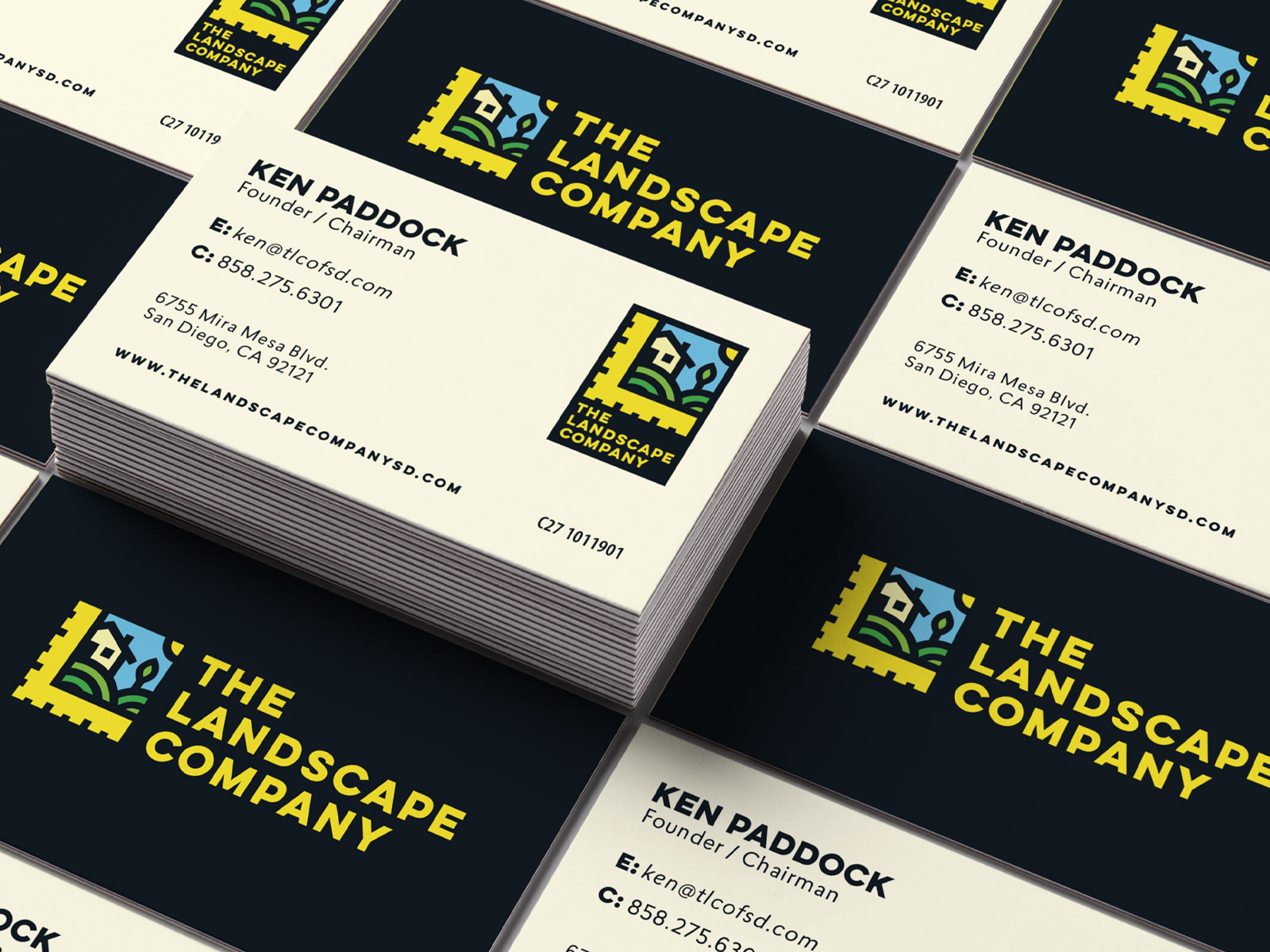
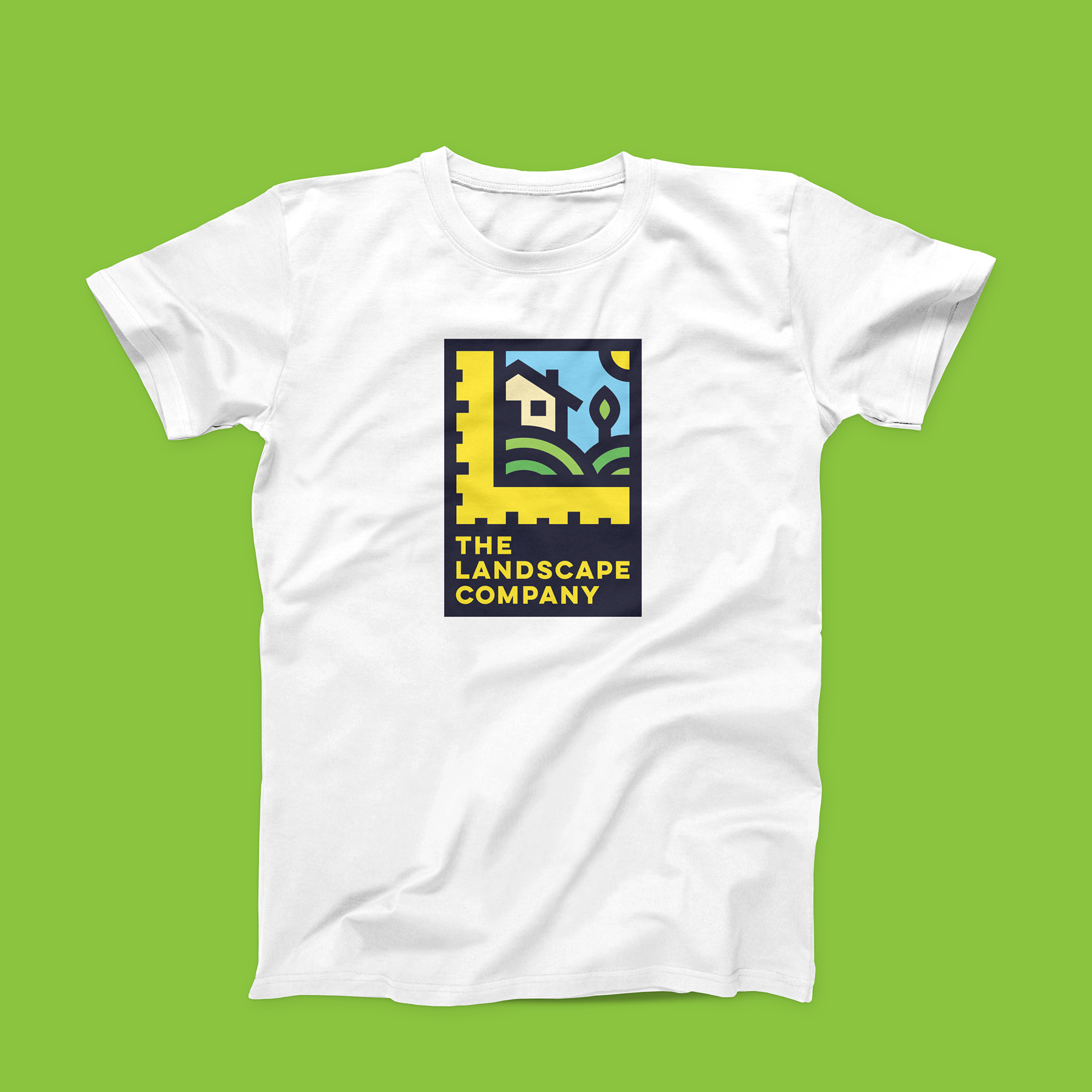
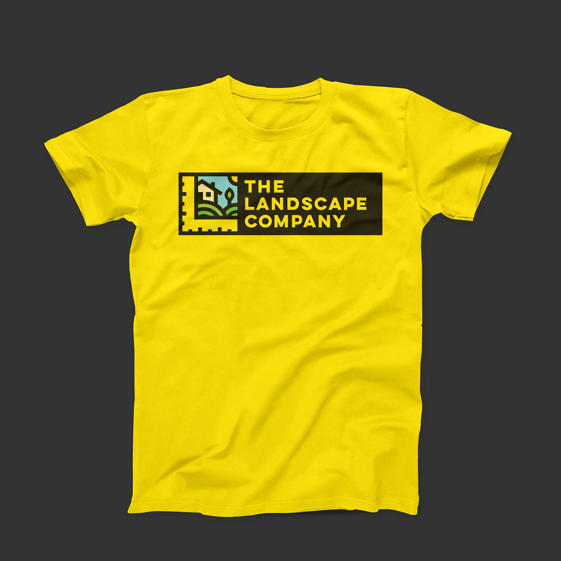
These colors also present opportunities to expand and activate the brand by applying them on to uniforms or vehicles, along with digital and printed marketing materials.


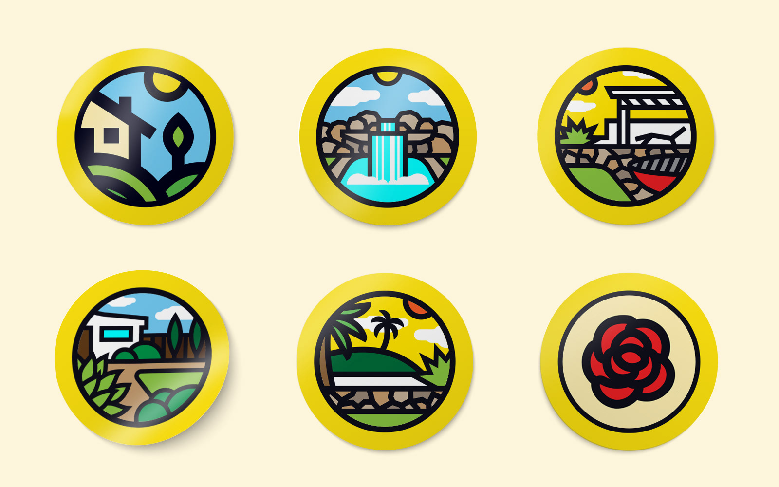
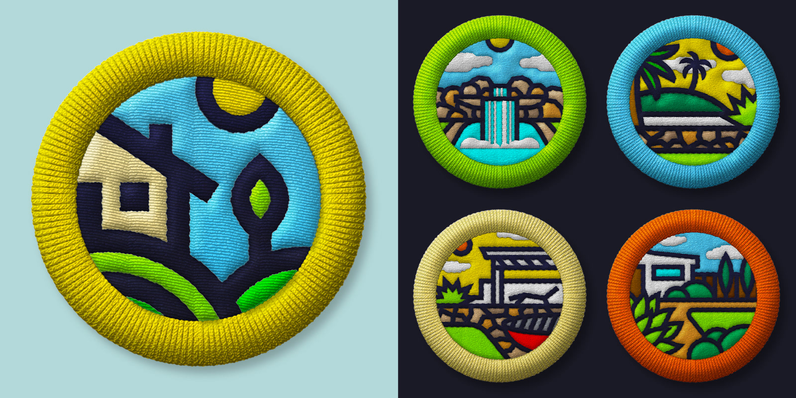
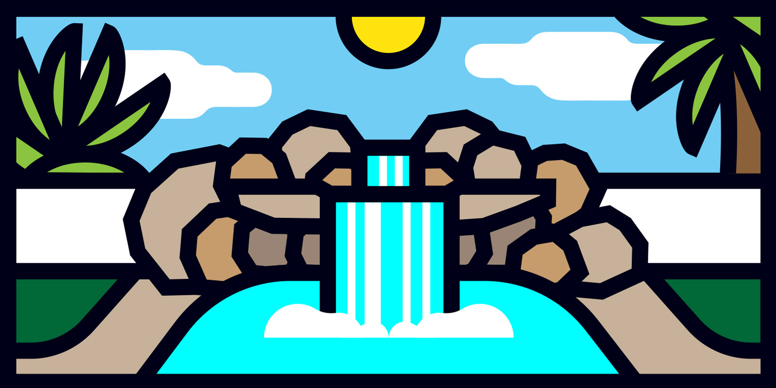
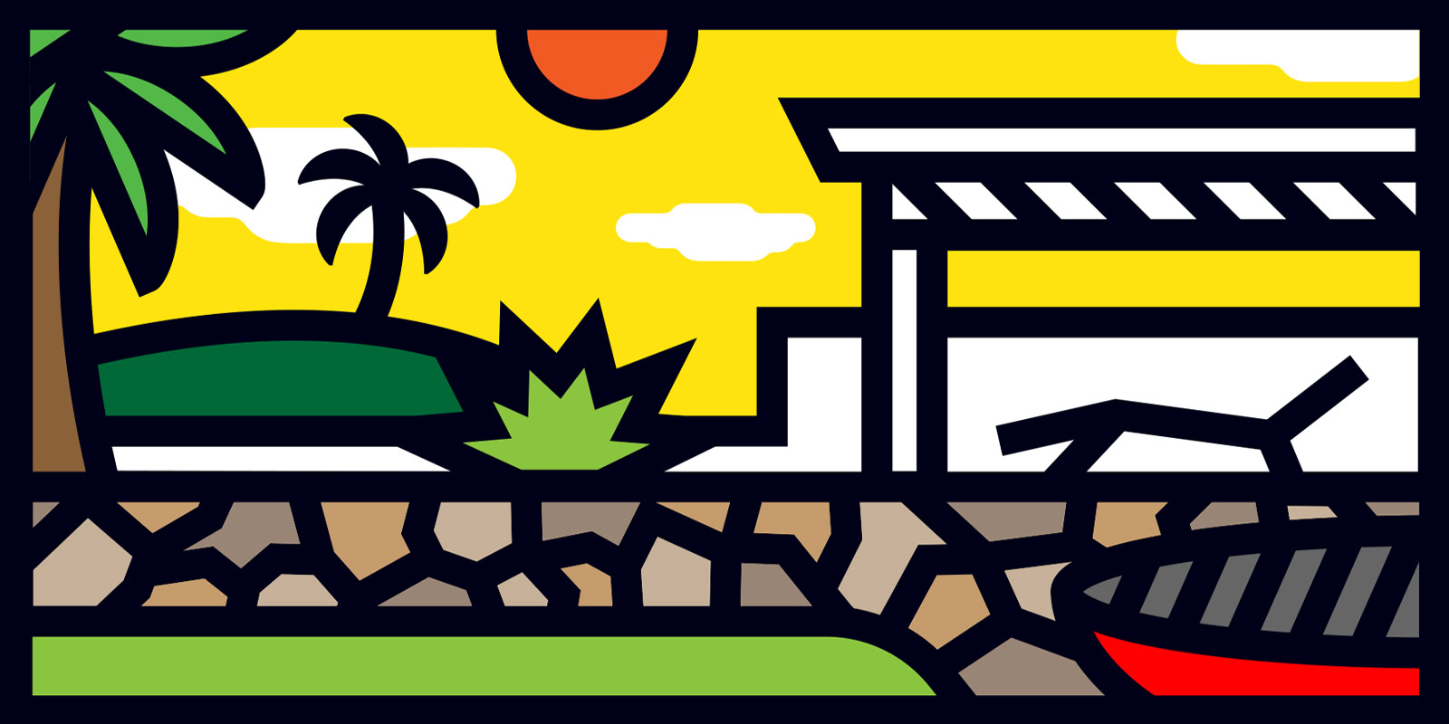
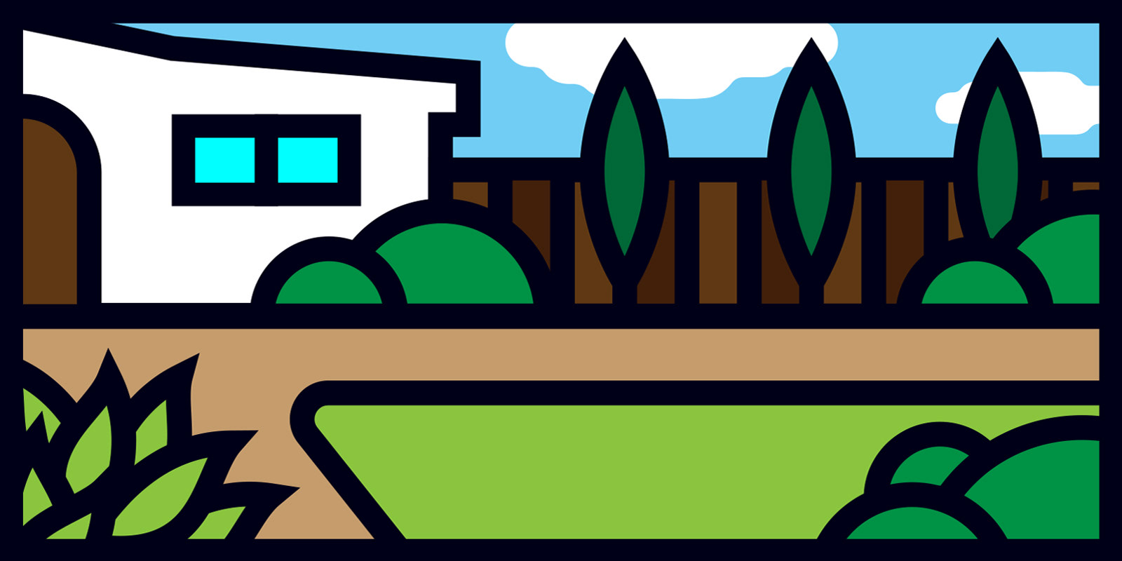
The logo design was well received by the company, so requests where made to expand upon the initial design. This meant creating series of illustrations for use in digital adds that transition into real life photos of landscape jobs. The style of the art is derived directly from the logo: minimalistic, bold lines, bright and eye catching colors.
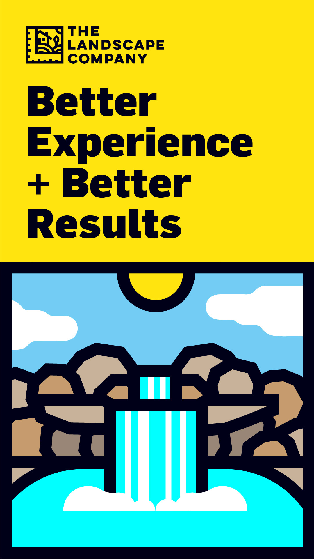
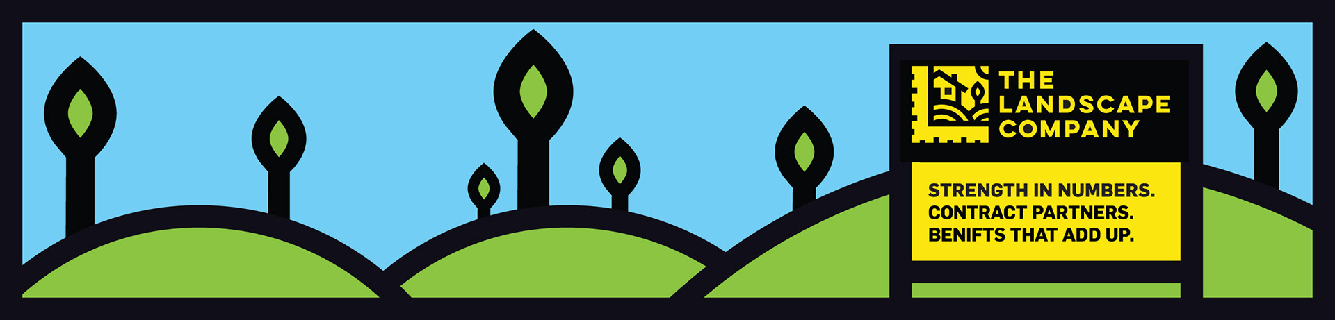
The illustrations where extended and used in various branded elements such as stickers and patches for office and promotional use.