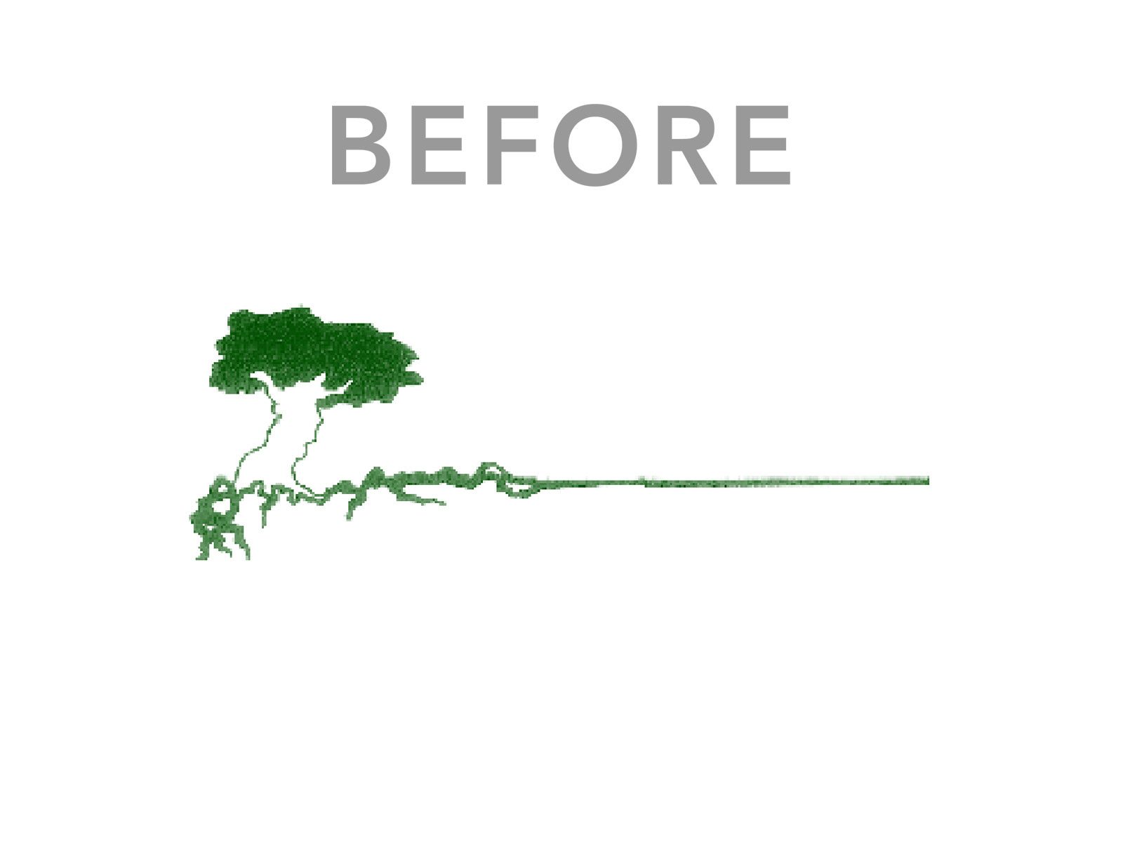
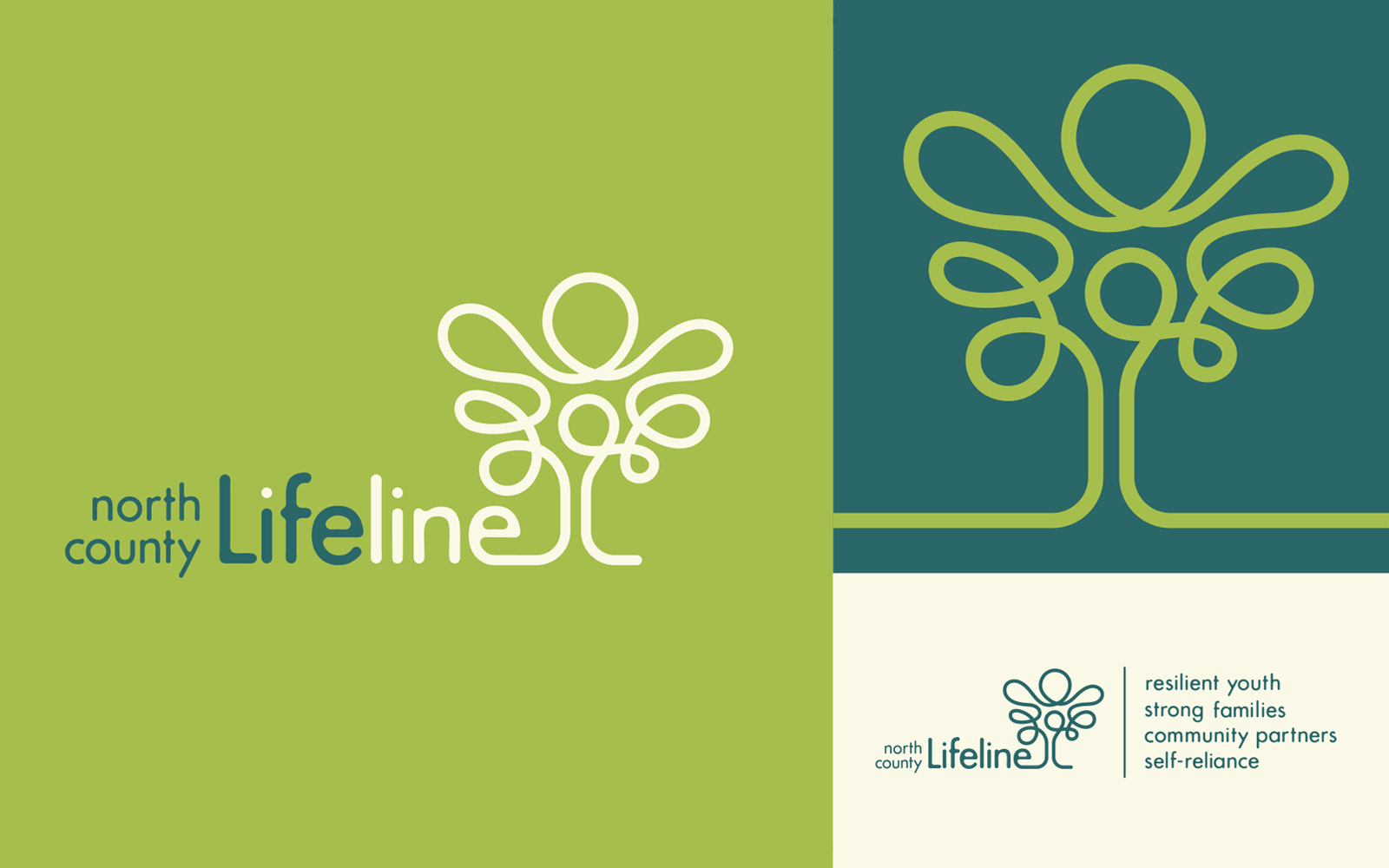
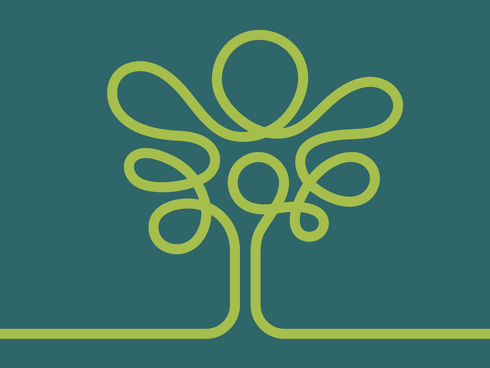
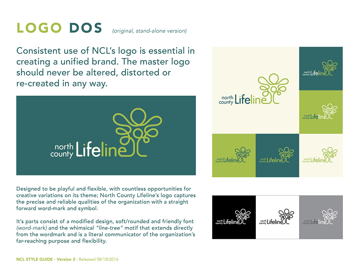
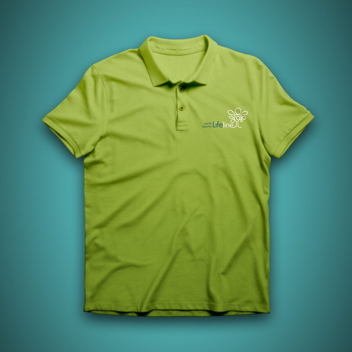
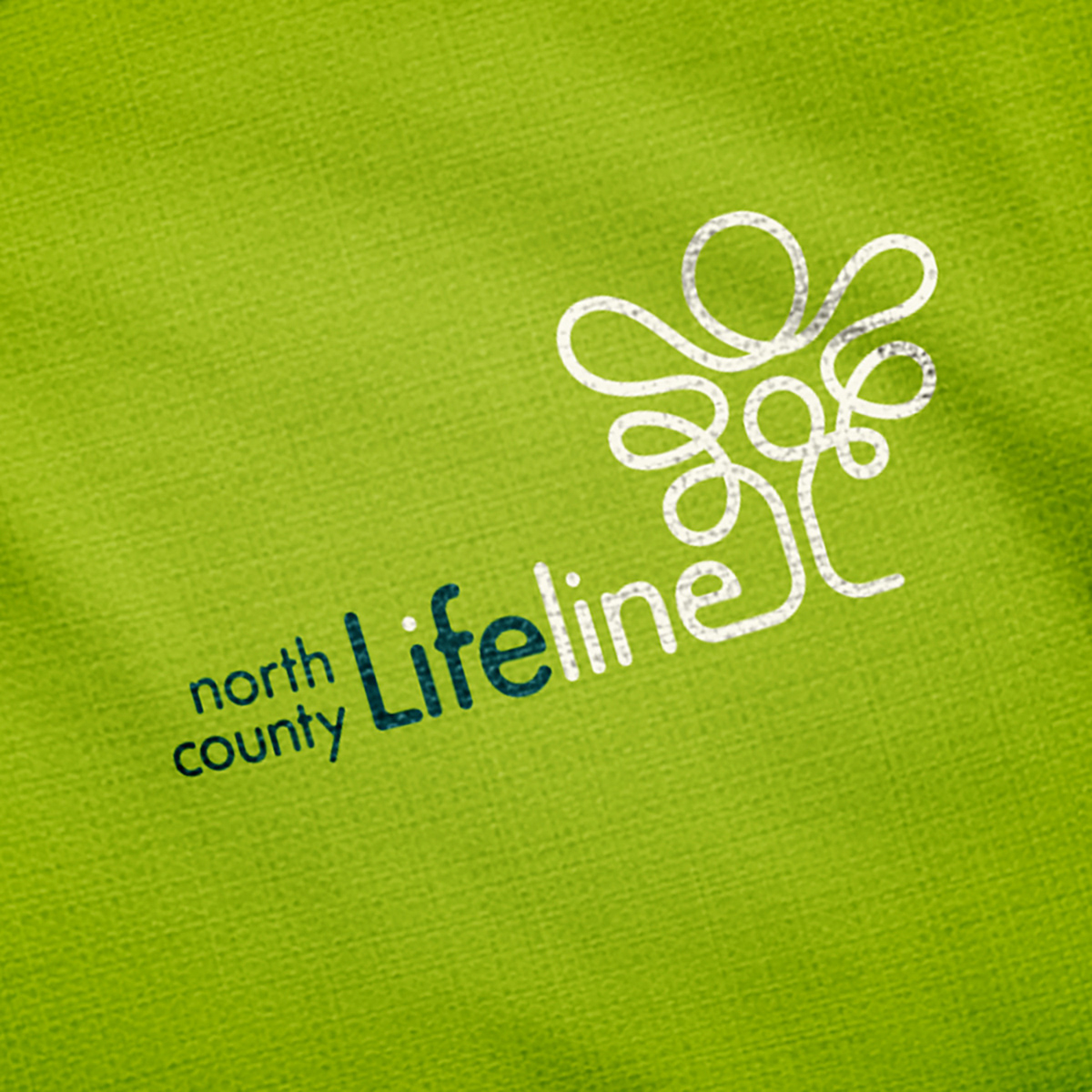
Logo design for North County Lifeline, a non-profit organization based in San Diego. The challenge for this re-design project was to evaluate and conserve the equity and recognition that the previous the identity had established through the years, while leaping it forward for a next decade or two.
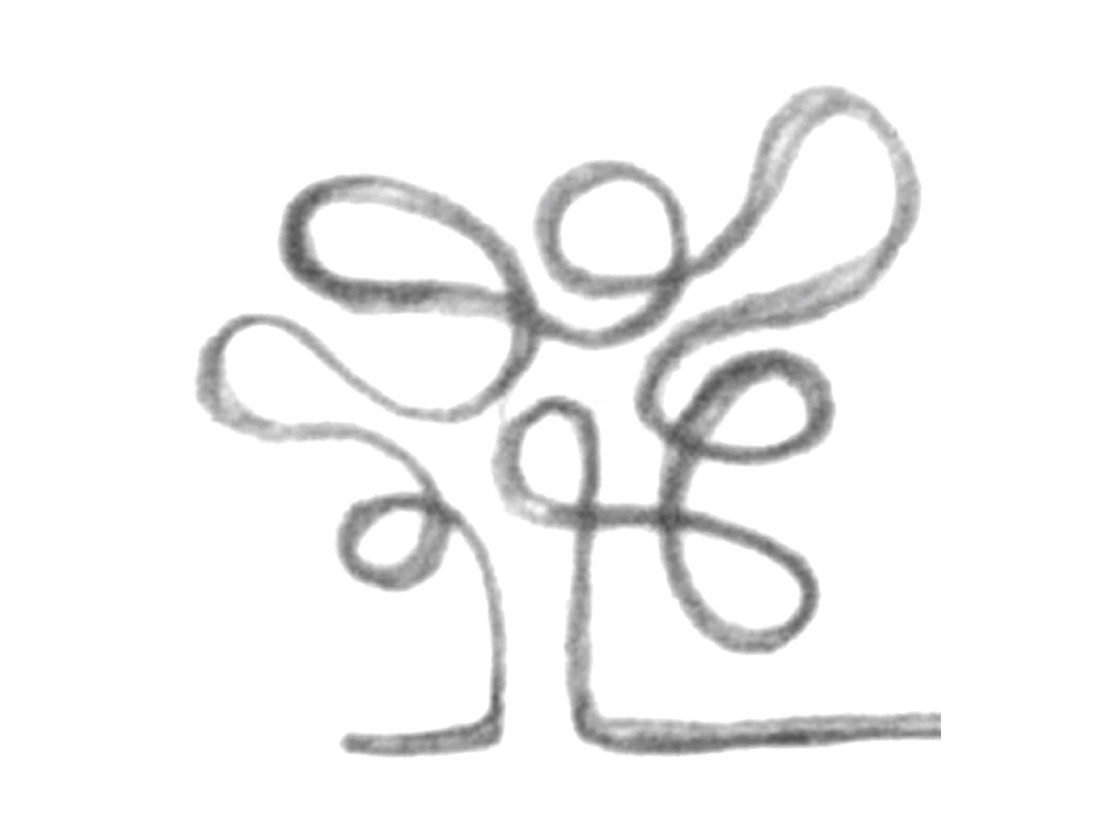
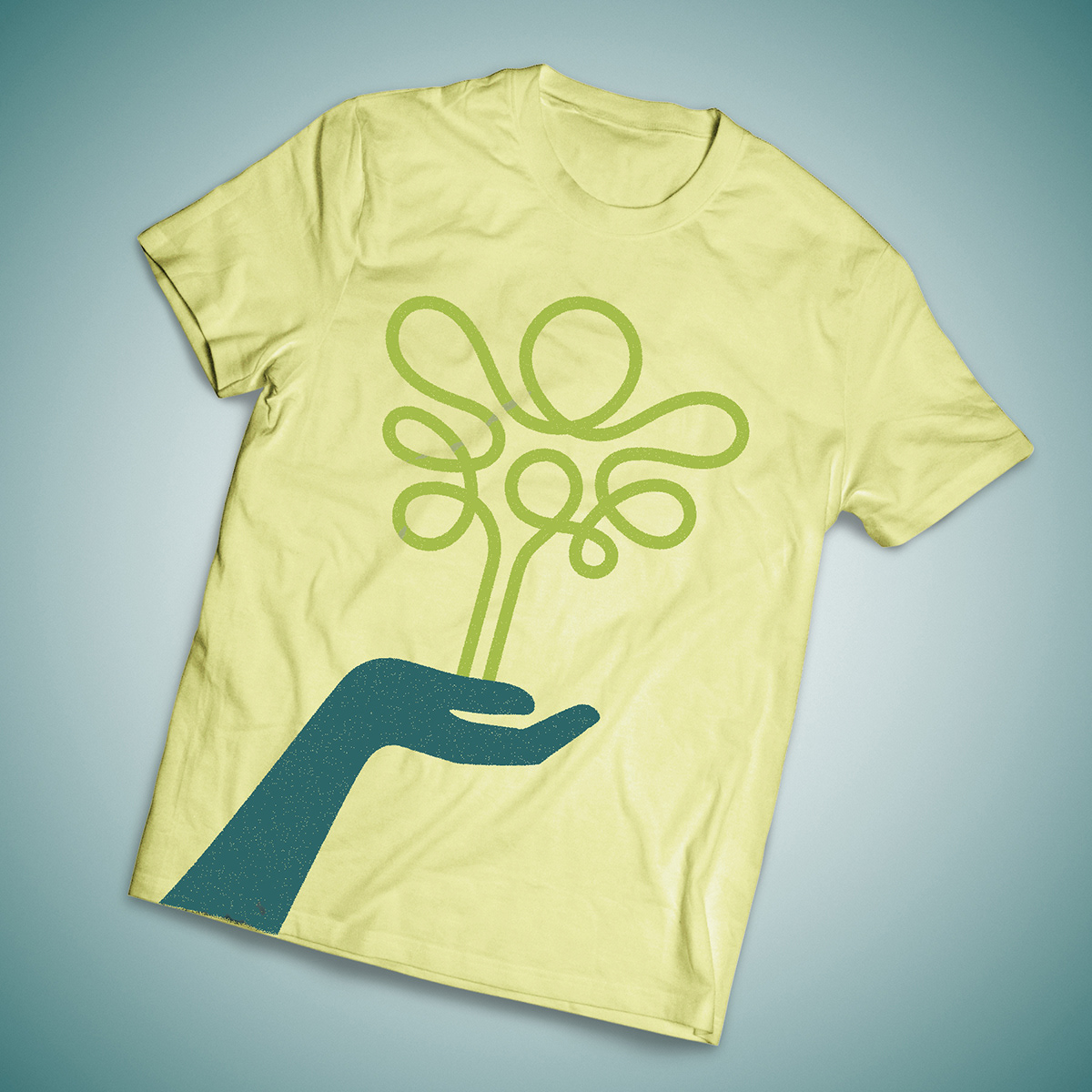
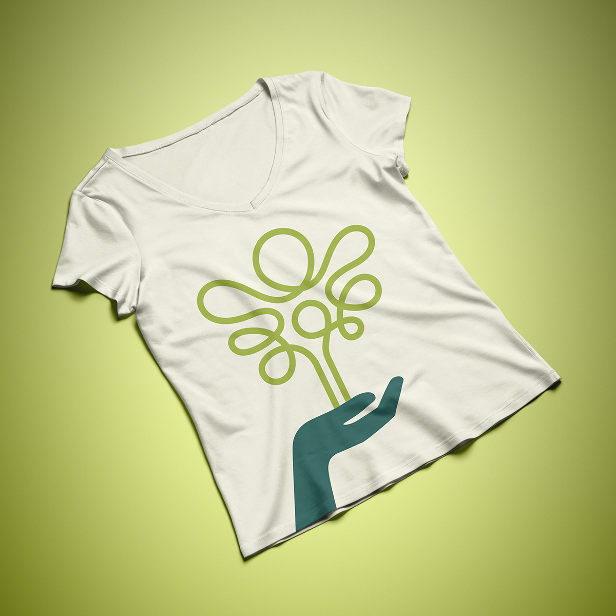
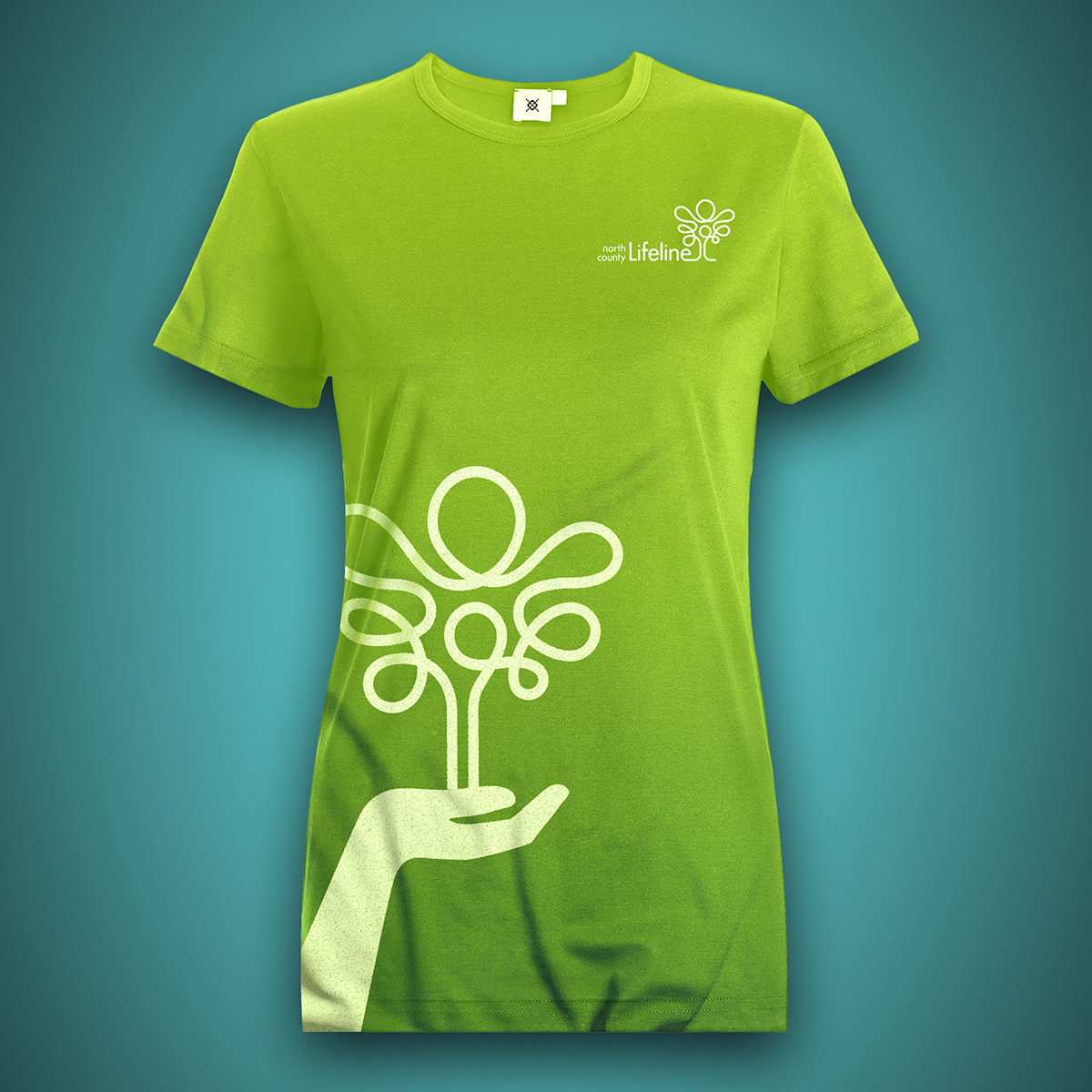
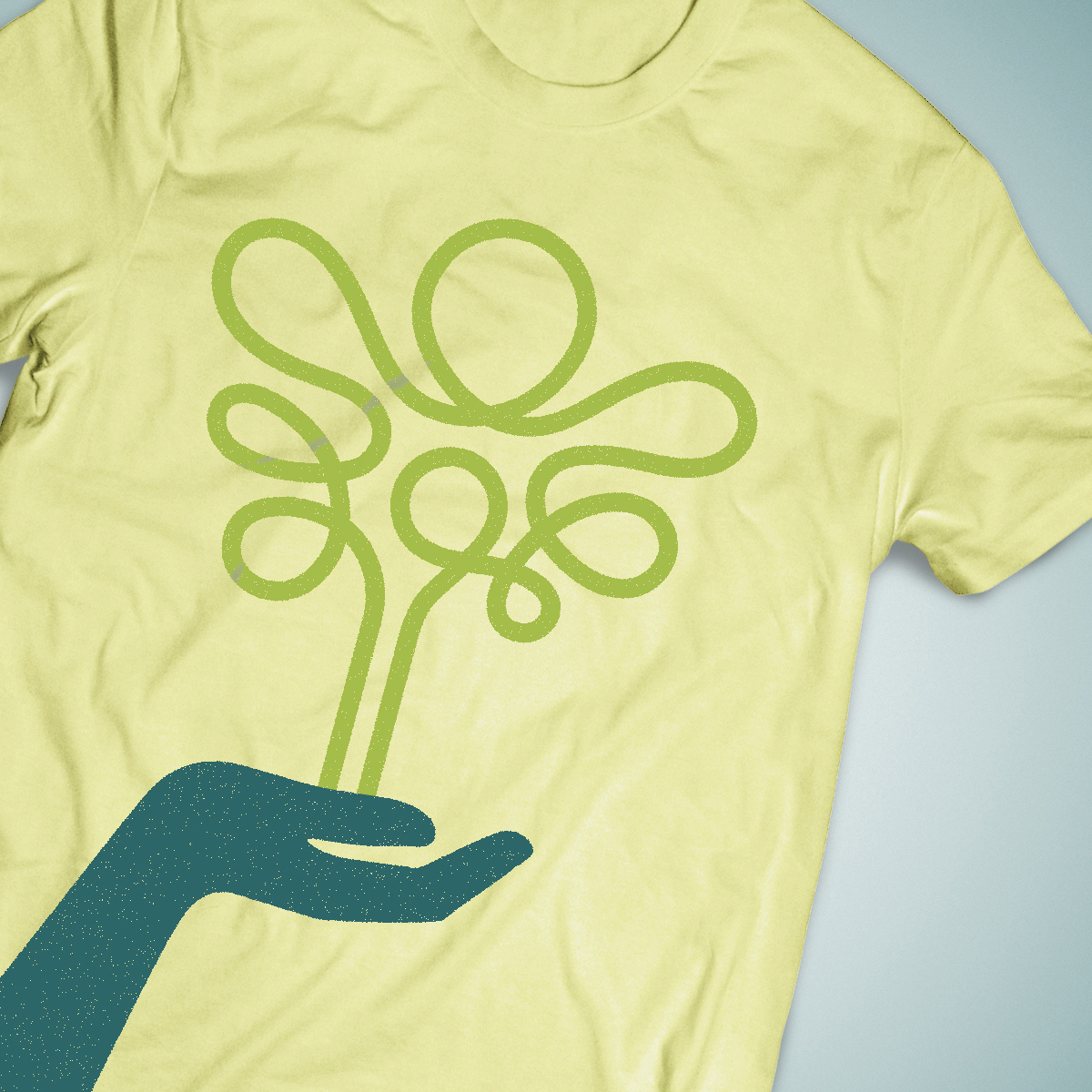
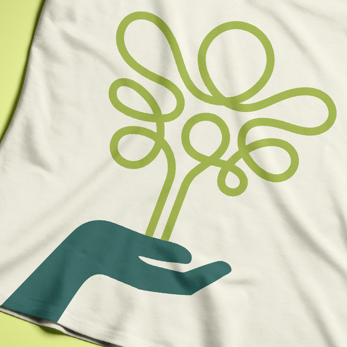
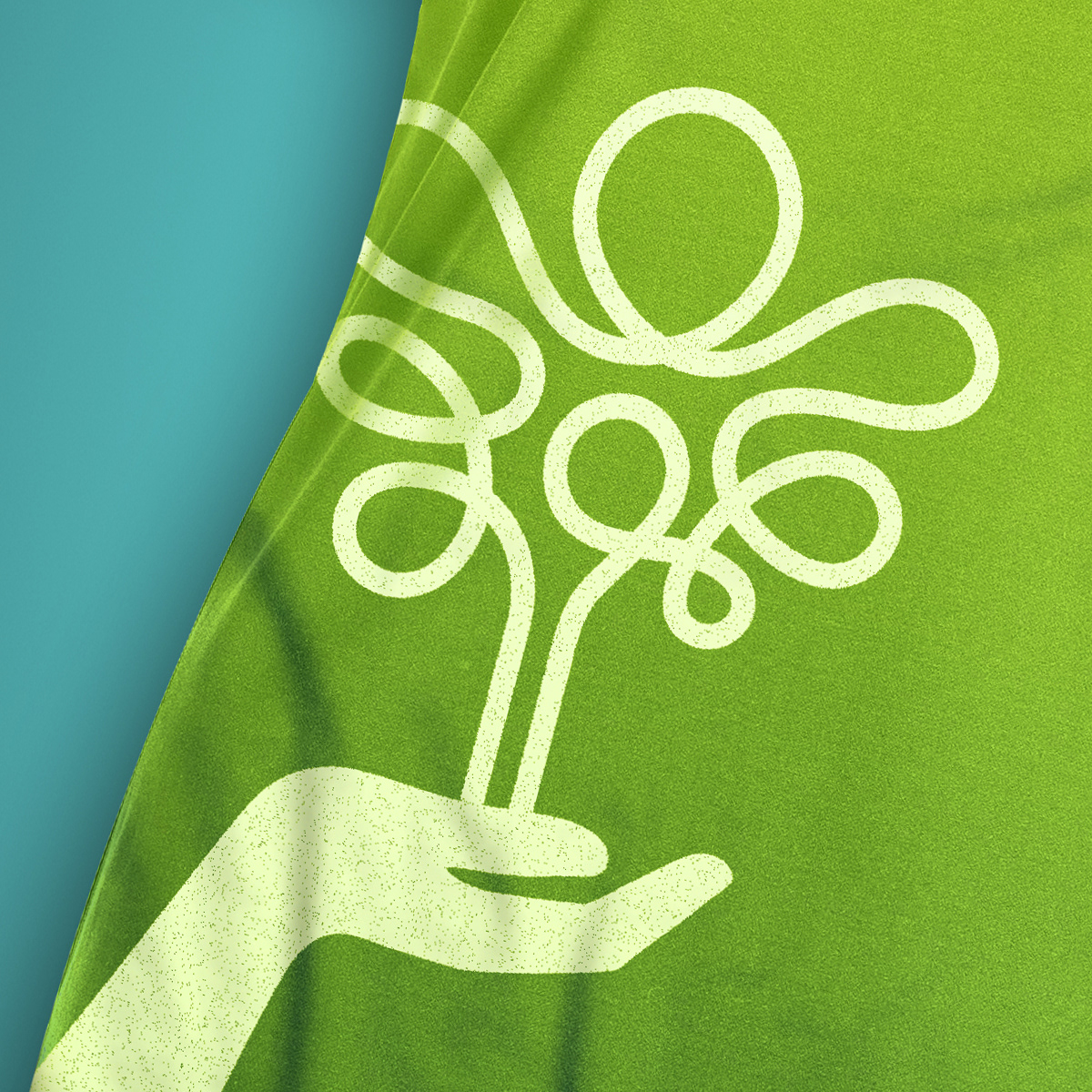
The creative direction is directly inspired by the idea of a life-line. This concept has the potential to express endless iterations of energetic, lively and artistic compositions to extend and activate the brand in any application.
The lifeline and catalyst to all North Country Lifeline brand application is this simple thread. Seed to extending brand communications and recognition in creative applications that are relevant to the organizations principals and goals.
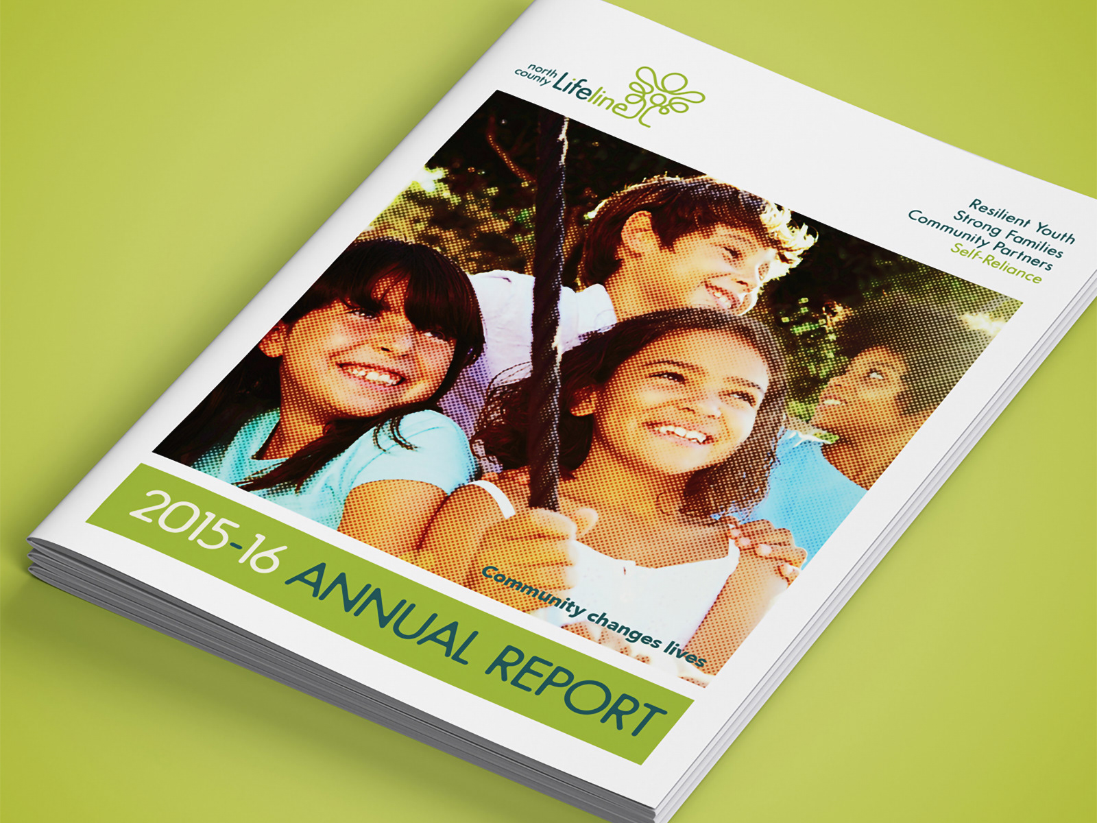
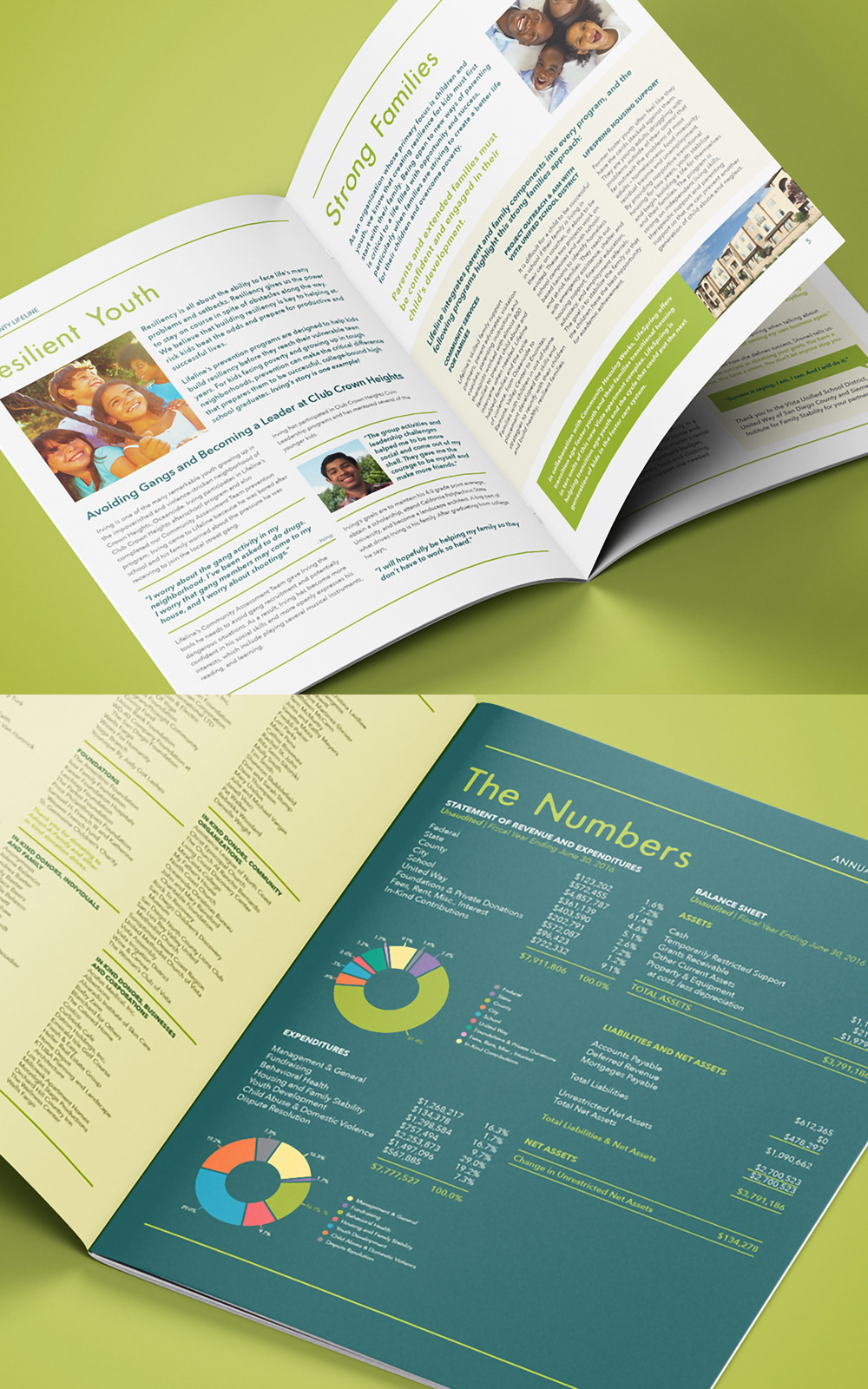
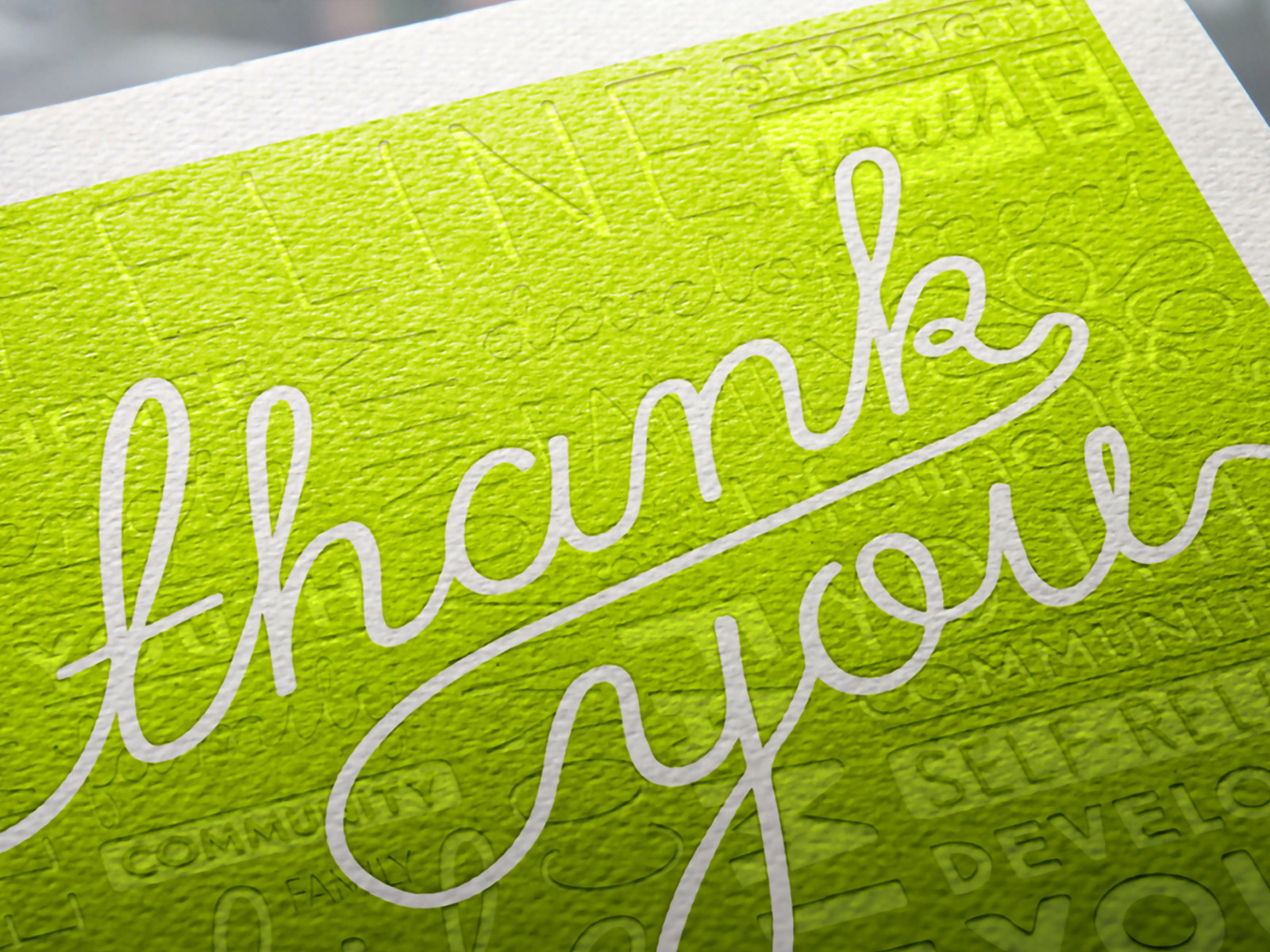
Annual report design and layout for NCL. This document represents a sizable shift and new creative direction for the organization, utilizing more lively color palette, along with simple but solid grid framework, complimented by lifestyle images relevant to their core values and mission.
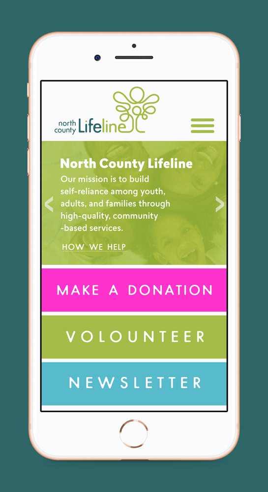
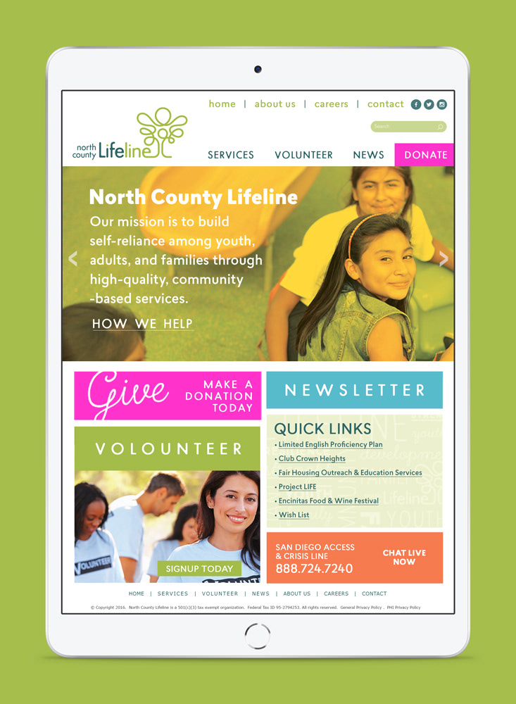
Website layout design and proposed framework hierarchy for North County Lifeline's digital platforms. As brand activation is ramped-up, the importance for a solid online presence, with clearly set visual communication priorities is essential in allowing visitors to engage decisively with desired or critically important content.
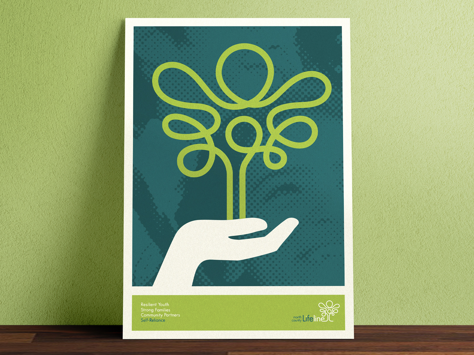
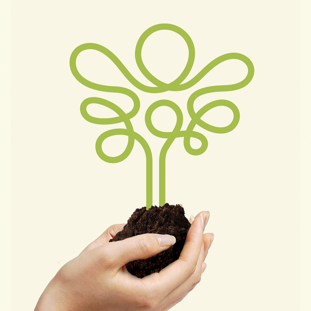
Poster design and extension of brand for NCL. The intent to continue promoting and expanding the brand as decorative element to compliment a household or relevant spaces. To bring joy and invite contemplation.
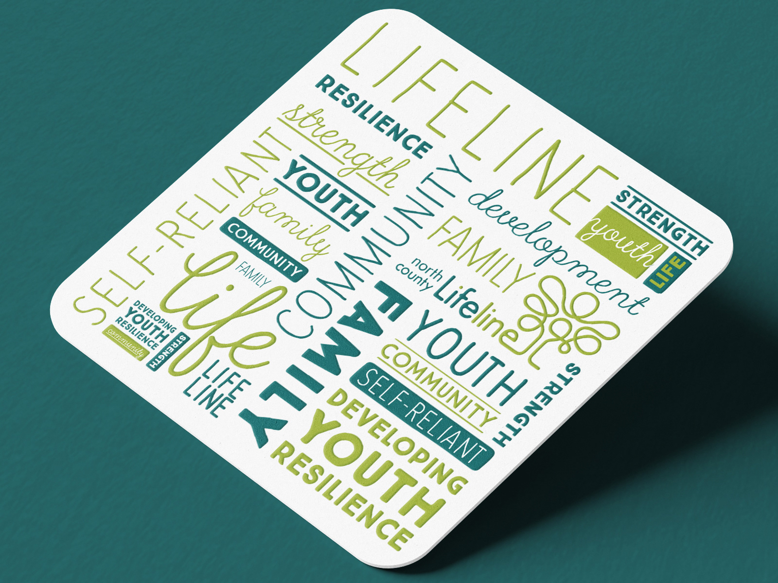
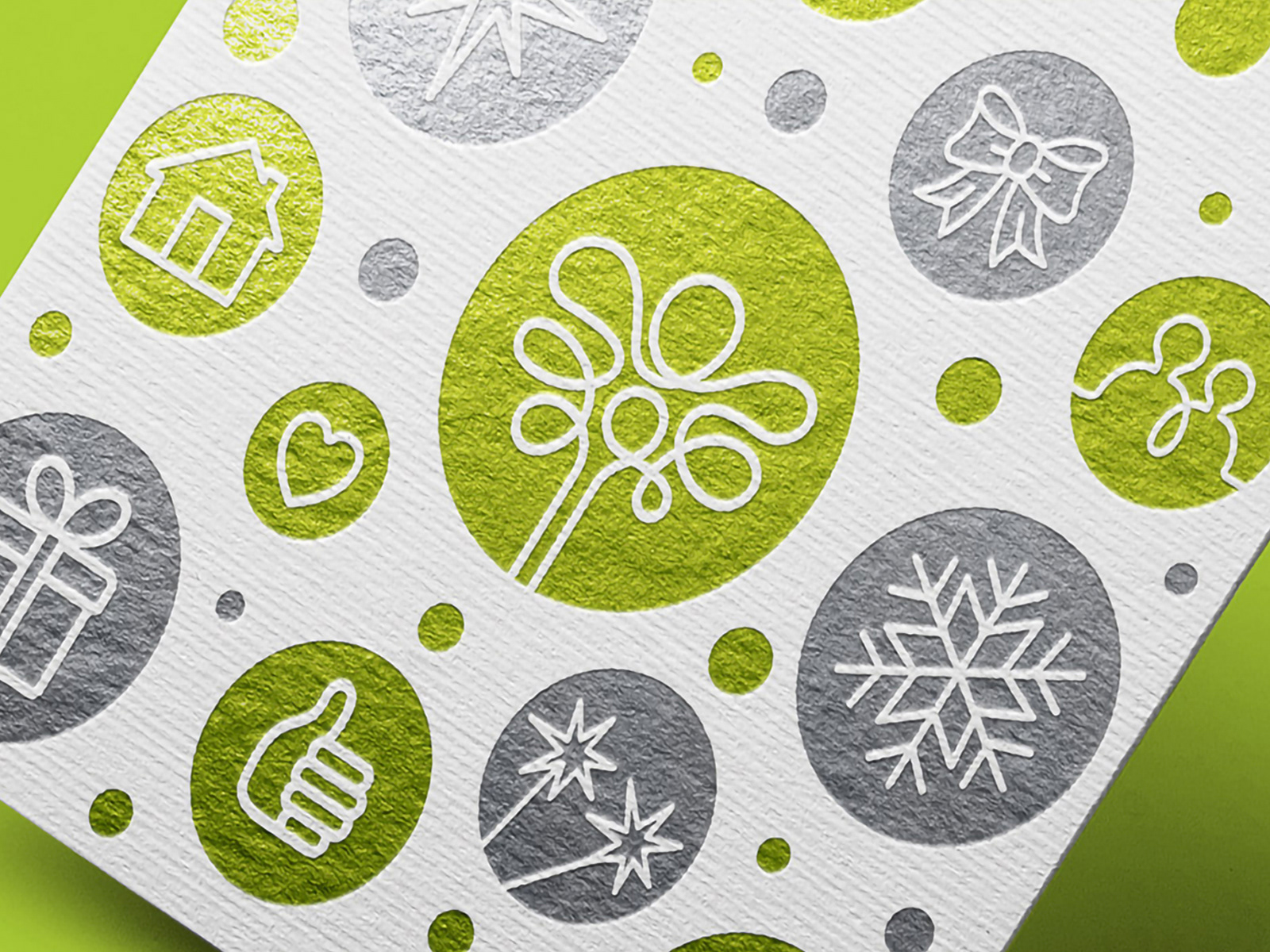
Application of brand colors, textures, logos and design elements onto a useful and practical coaster format. Great for use at the office, home, or gift to friends and family.
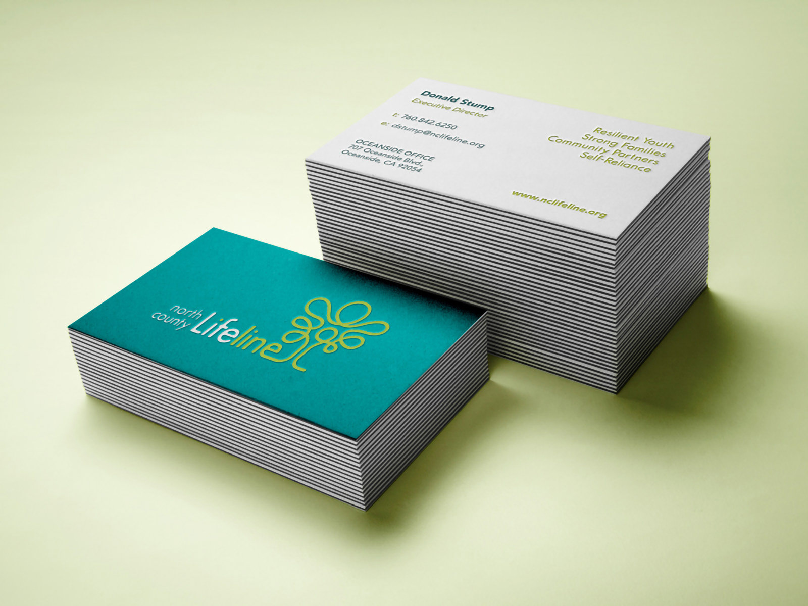
Cornerstone and still an essential branded tool for commerce, the NCL business card is direct in presentation and layout of relevant content. Intended to feel solid and sturdy in hand and leave a lasting impression to new acquaintances.
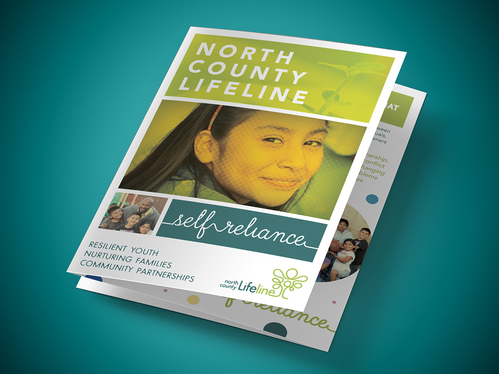
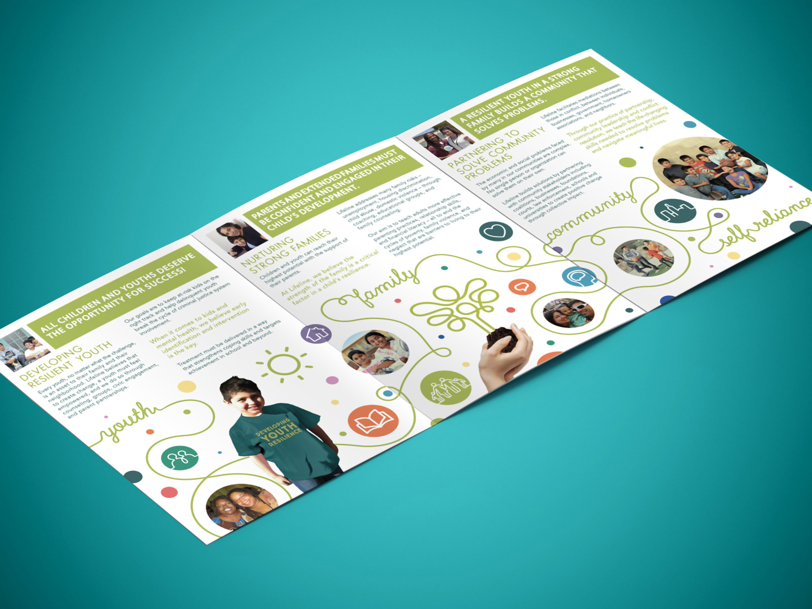
A brochure showcasing NCL's core values, its mission, vision and capabilities. The creative principles applied to the layout are the application of a modular grid system to allow versatility and harmony to the layout, using all the available brad elements to their full extent and maximize impact, function and readability.
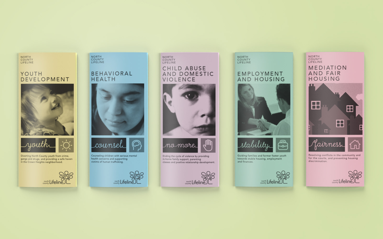
NCL deals with a range of causes, some of which deal with very delicate topics. To help promote the various programs, this brochure system designed and setup as editable templates for desktop printing. Keeping costs down and making use of existing resources. Each brochure has a designated colored paper to differentiate its category.
"Jorge, you helped us by creating our extraordinary, whimsical logo when we re-branded 10 years ago. - People still tell me all the different images they see in the tree...it's like a Rorschach test. My favorites...a father holding his children, an angel....a tree. Most importantly, a continuous lifeline to the community.”
- Don S., Executive Director