
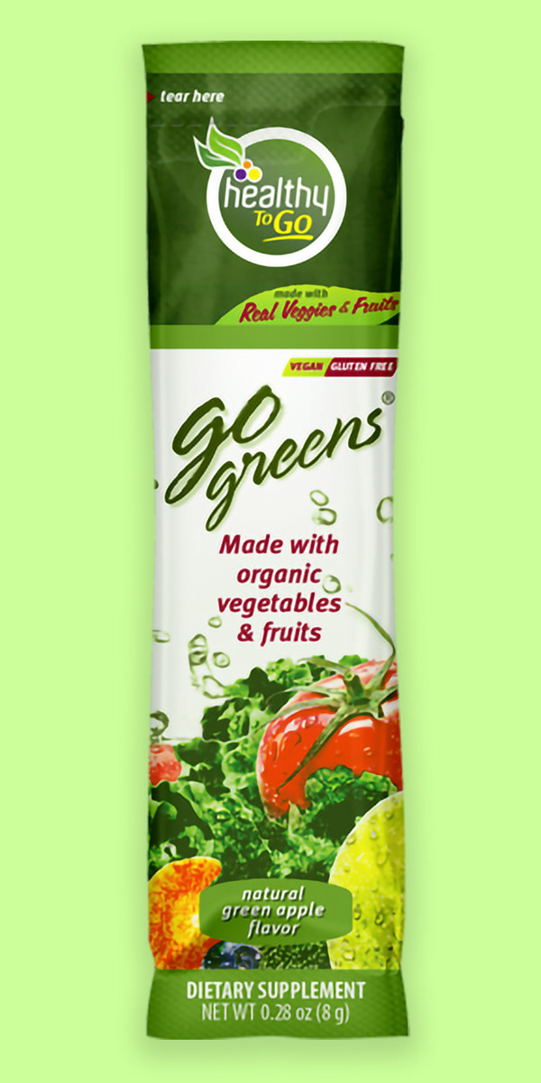
Rebranding for Healthy To Go, a subsidiary brand for To Go Brands, Inc. The dietary supplement products consisted of natural ingredients, dehydrated into fine powders taught are then mixed with water, yogurts, poured on cereals, etc, and supply a substantial dose of nutrients to consumers.
The opportunity arose to change the look of the entire product line. The goal at that time was to improve the visuals with a sense of freshness, to re-engage with existing customers and attract new ones, and generate interest in potential investors.
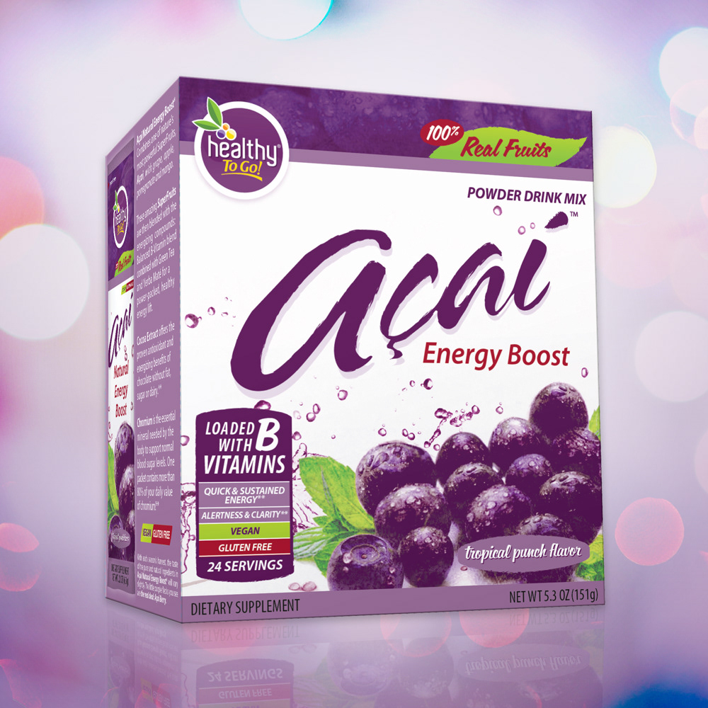
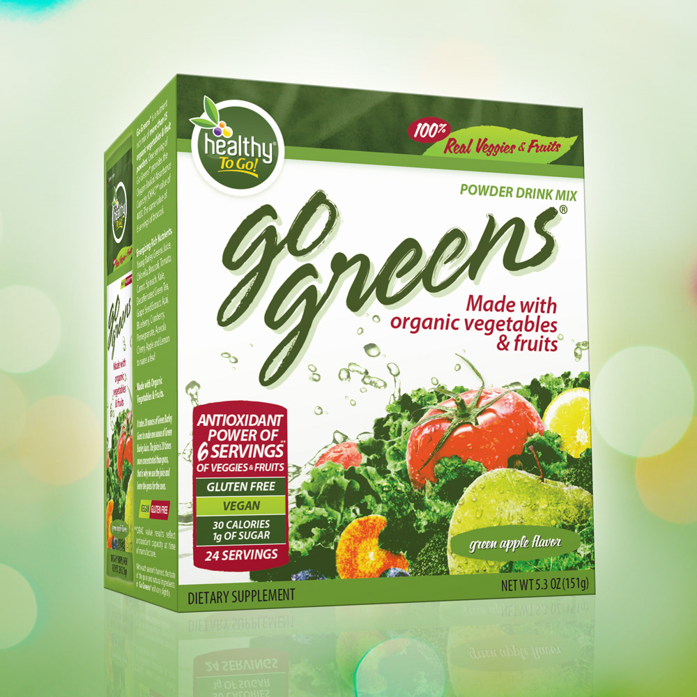
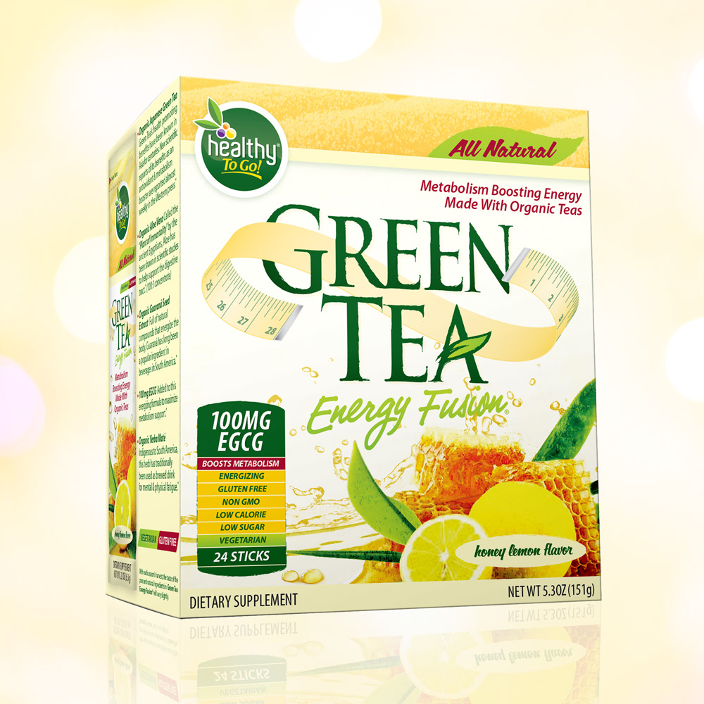
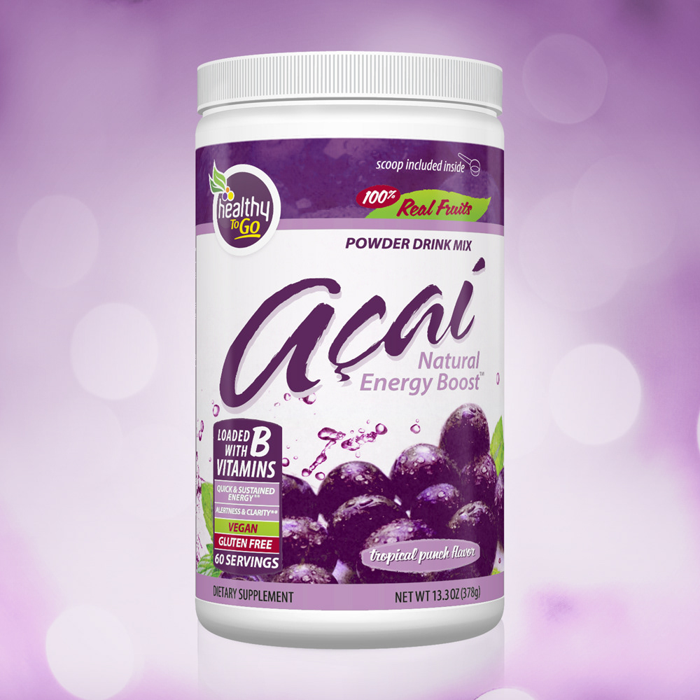
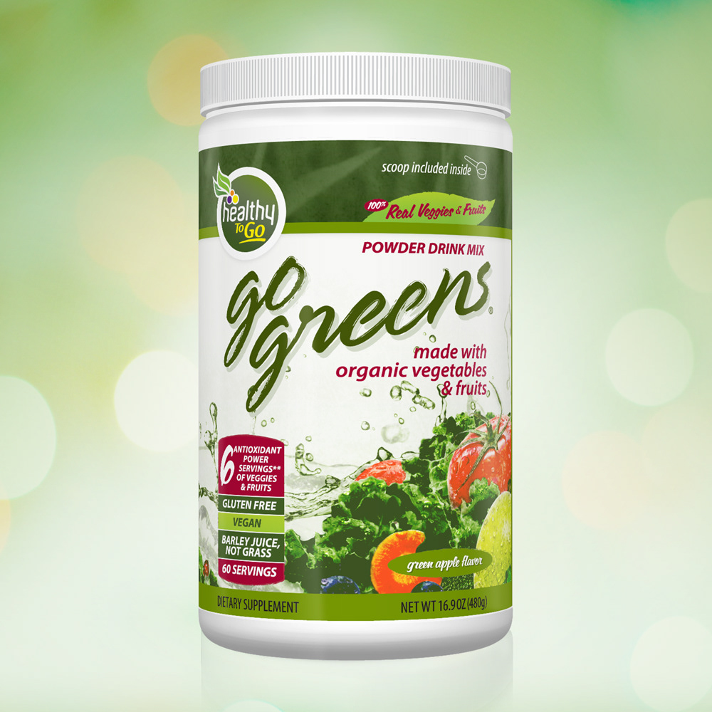
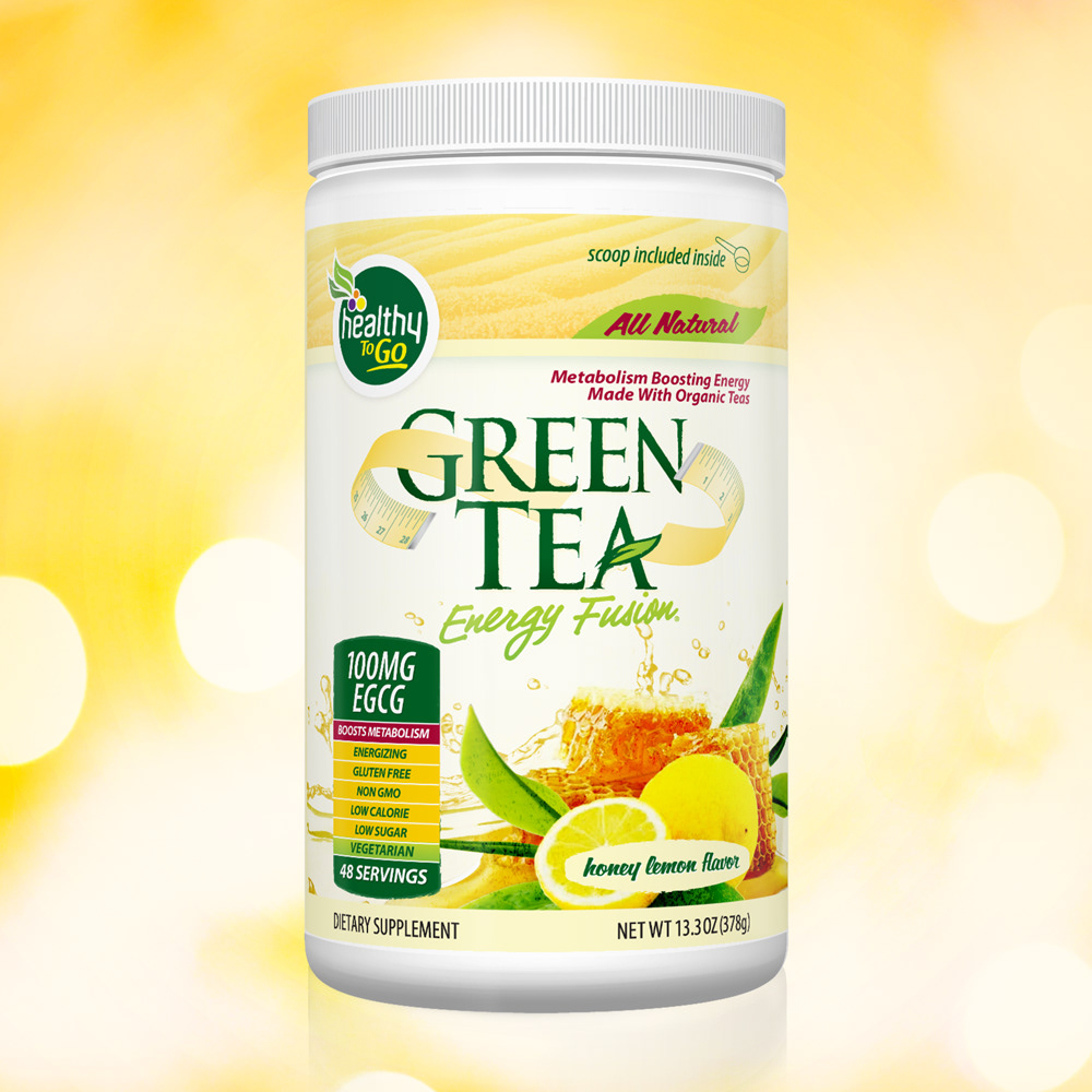
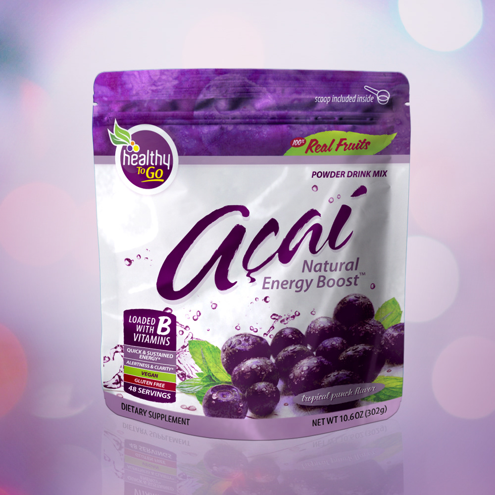
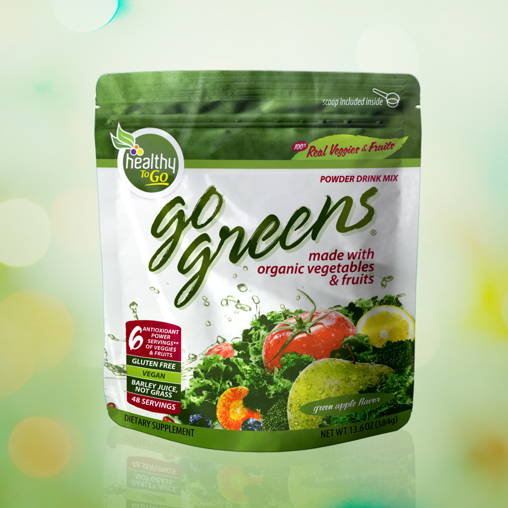
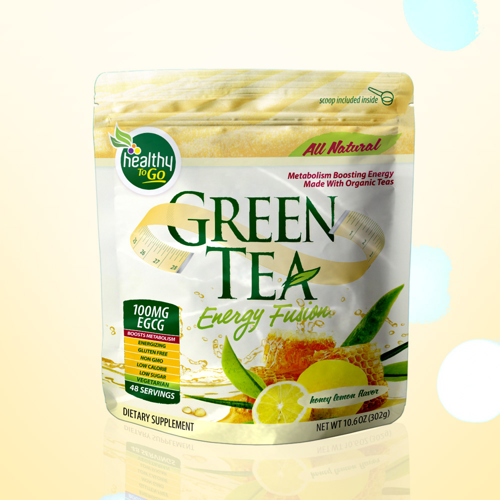
An important starting point to consider before initiating the rebranding effort for HTG was the considerable equity the brand had solidified over their years with loyal customers and distributors alike.
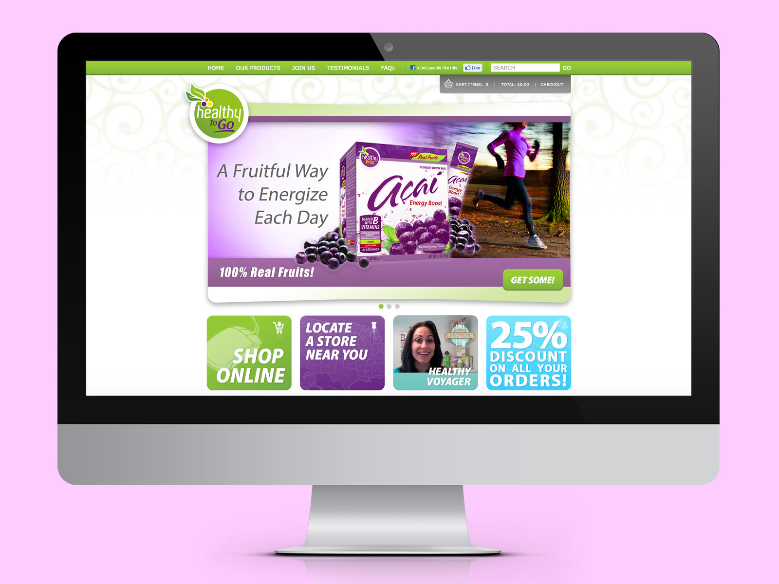
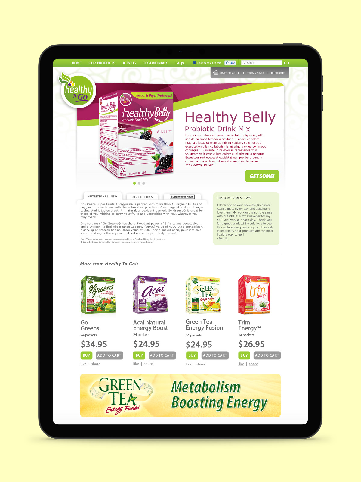
UX/UI design for the HTG website and online shop, incorporating the new visual aesthetic of the re-branding effort. The platform chosen at the time was Wordpress for its easy shopping cart integration.
In the end, the new branding was well received by consumers and proved to be effective in attracting new investments and soon after found new ownership.
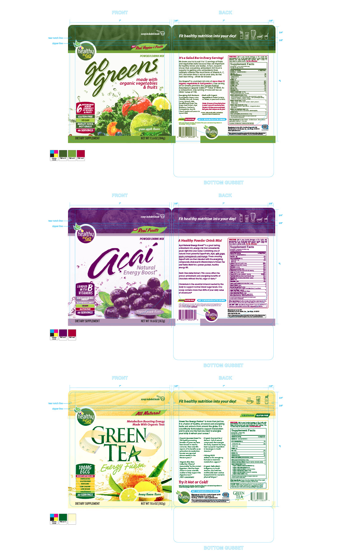
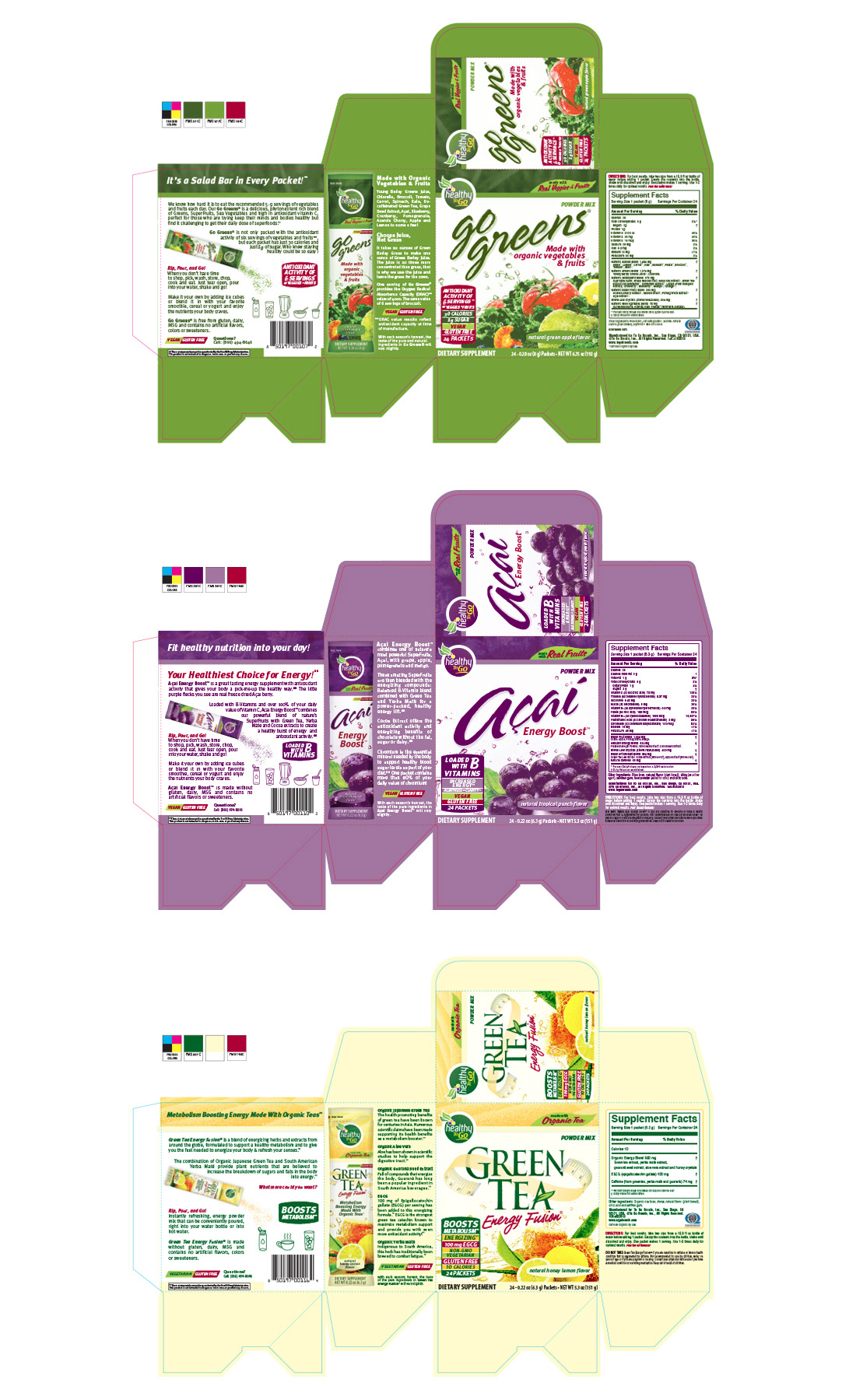
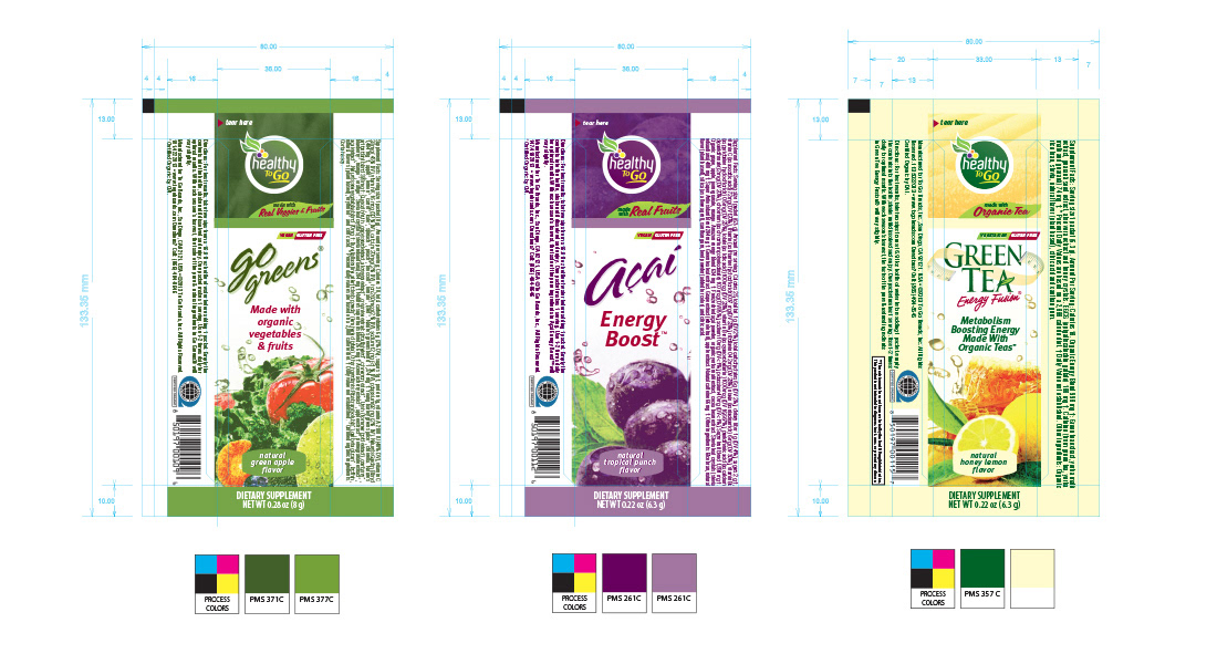

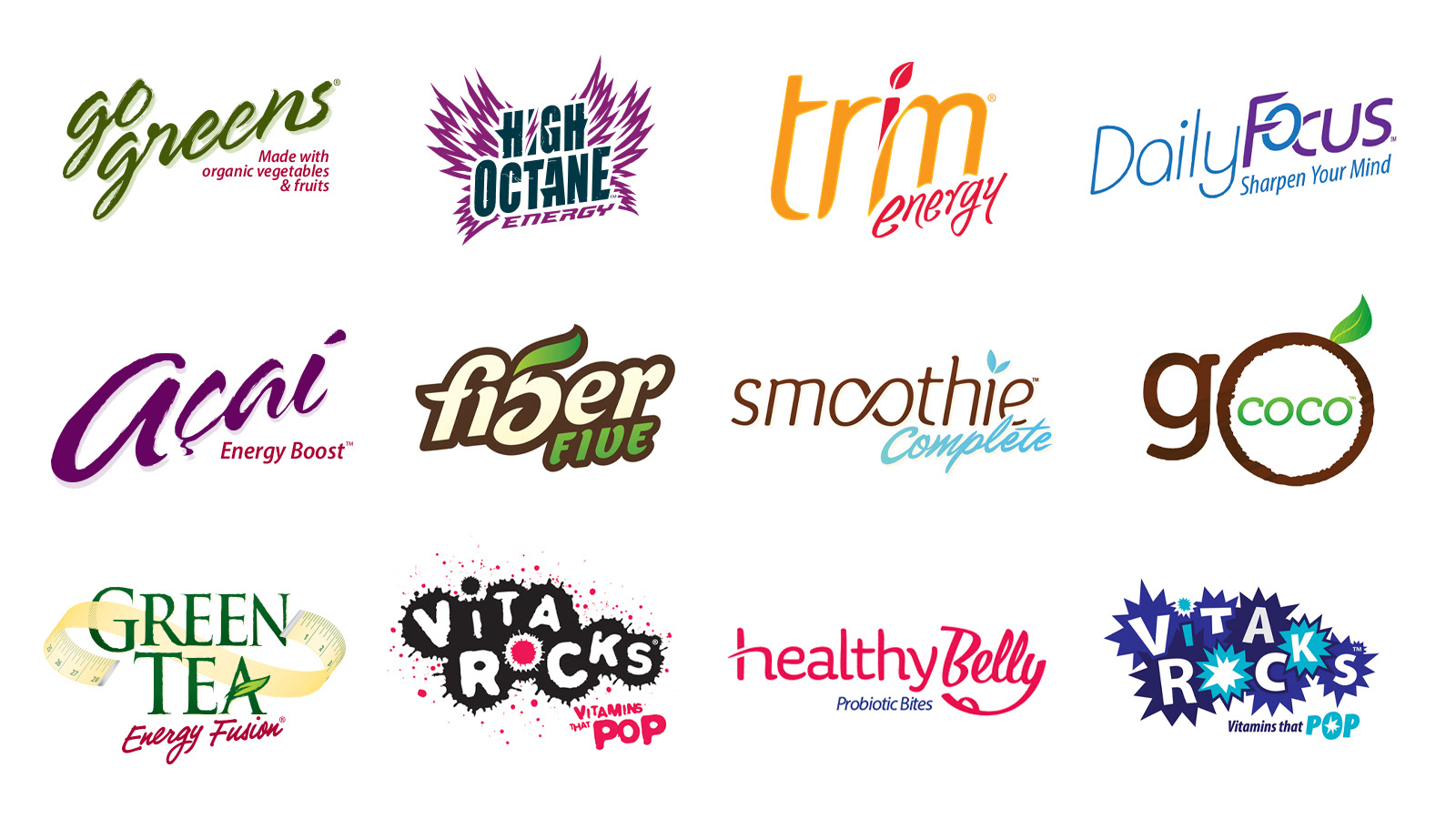
Above are a few samples of the many product identities created for To Go Brands, Inc. under the Healthy To Go umbrella.
Although the new designs are a considerable departure from the originals, a few elements retain their essence to ease the transition in consumers eyes and maintain familiarity.
Below are a few examples of the original packaging:
