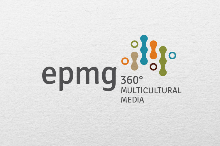

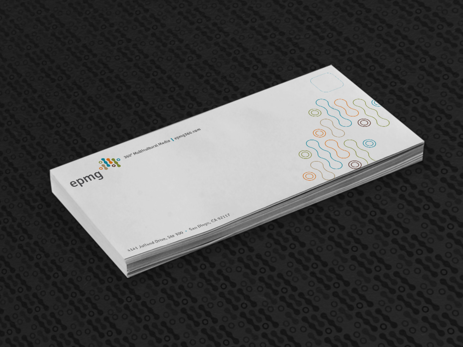
Logo design for EPMG, Multicultural Media company. The design concept lent itself to the use basic geometric principles to achieve the right balance and spacing. Created as a contract work for a local (San Diego) design studio.
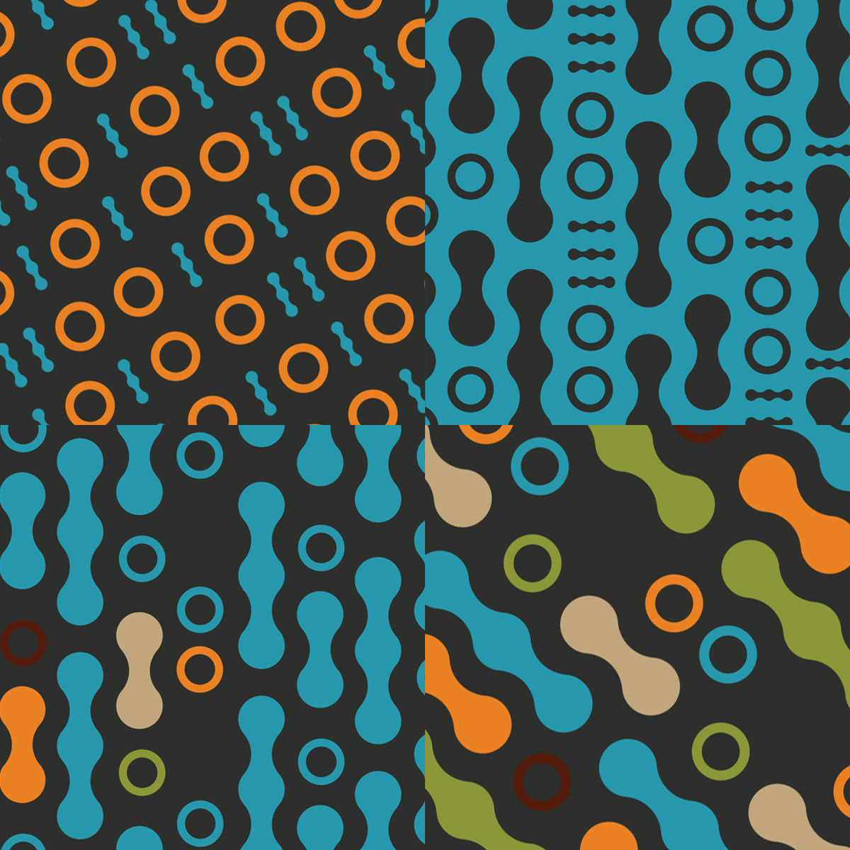

An element of precision was taken into account during the process as it seemed a natural choice considering the nature of the business. The logo's shapes and colors are intended to communicate diversity through the use of elements that allude to human forms and data streams. The elements are an abstract and graphic interpretation of binary code.
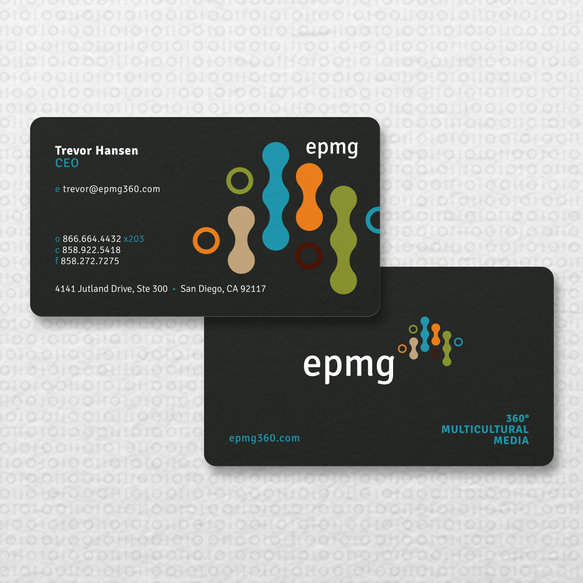
Foundational to EMPG logo design solution where simple geometric proportions and spacial relationships. All elements included on the final design are required to be presented collectively and individually. For this reason, a sort of graphic scaffolding system was necessary to hold it all up-right and provide breathing room for the eyes by allowing space to flow.
